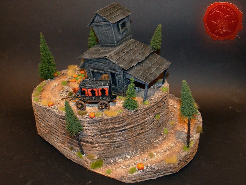
House on the Haunted Hill

Marko Paunović, 11th September 2020

Any old west town has an undertaker's and Malifaux shouldn't be any different, because let's face it, the burrying busines thrives in the city of Malifaux.

Idea and planning

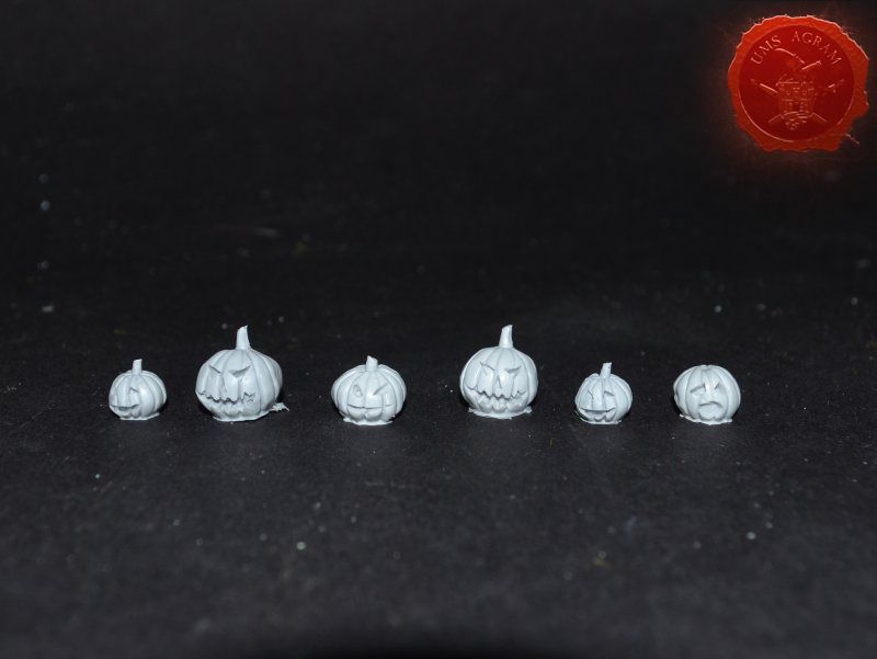
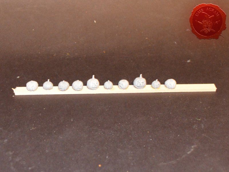
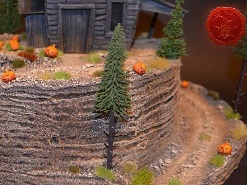
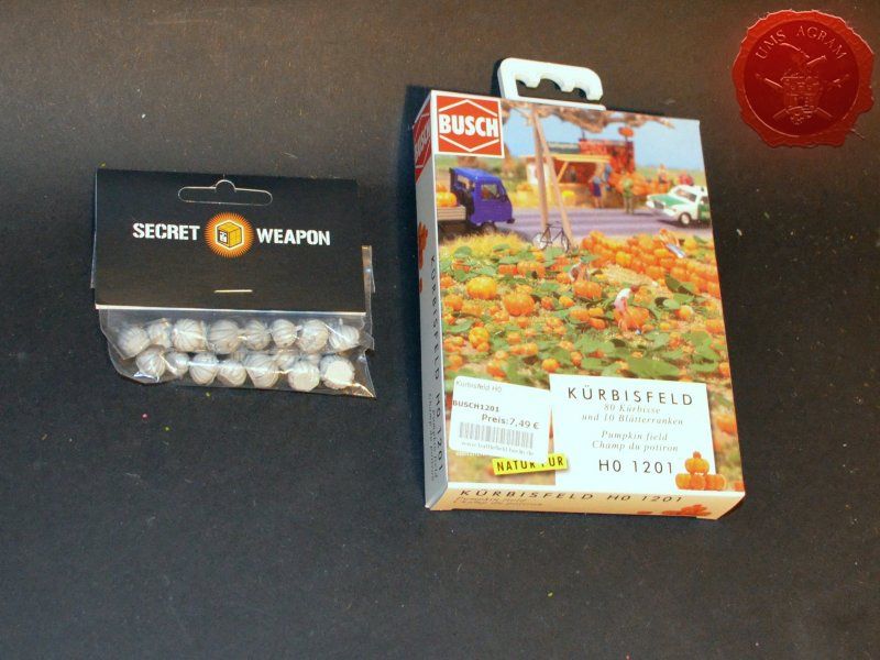
By now you should already know my mantra about how crucuial planning is in any bigger project. Since I'm doing a more or less typical Haloween structure set in Old west, I started my google search and instantly I found pictures of several types of wooden structures that I was going for. Mostly I got a lot of Tim Burton hits which was perfect. A rickety old wooden house on top of a hill with a winding road leading up to it. Something like the opening scenes of the movie Sleepy Hollow. This gave me the idea of adding some jack o'lanterns to the terrain, as well. Being too lazy to sculpt my own, this in turn, prompted me to start a search of some jack o'lanterns. I knew I saw a couple of crews on the Wyrd forums that had some on their bases. Almost immediately I found some by Secret Weapon Miniatures and purchased them as I was aware that it would take them a while to get from the States to me in Croatia.

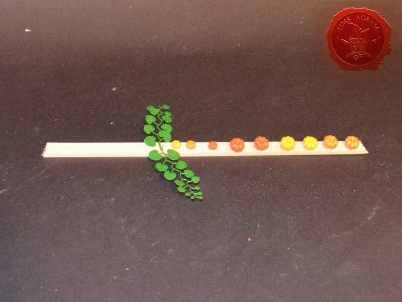
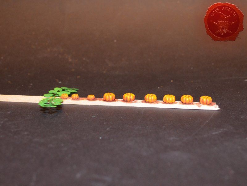
During my search for jack o'lanterns, I stumbled upon some model pumpkins made by Busch. Being reasonably priced, I ordered those as well.

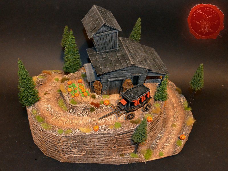
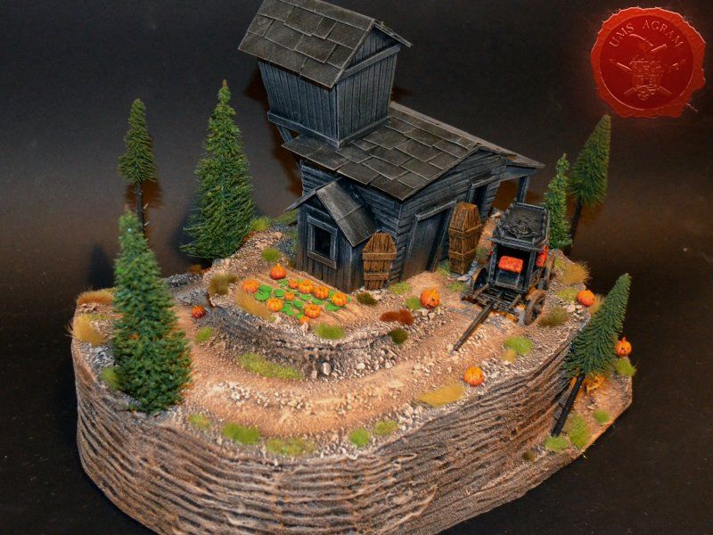
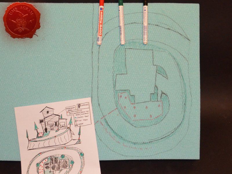
I now had some details that I knew the folks at Wyrd would love and I had a rough idea what my terrain should look like. It was time to put it all to paper. Begining with the house, I started drawing on a blank piece of paper. Once I had the preliminary sketch, I transfered it to graph paper. This provided me with some measurements that I could work with. The hill would be 10 cm high, the house would have a rough footprint of 10x8 cm while the whole terrain would have a footprint of roughly 30x40cm. This much space would allow me to have the winiding road – wide enough for a hearse (which I accidentally found in my bits box and decided to use).
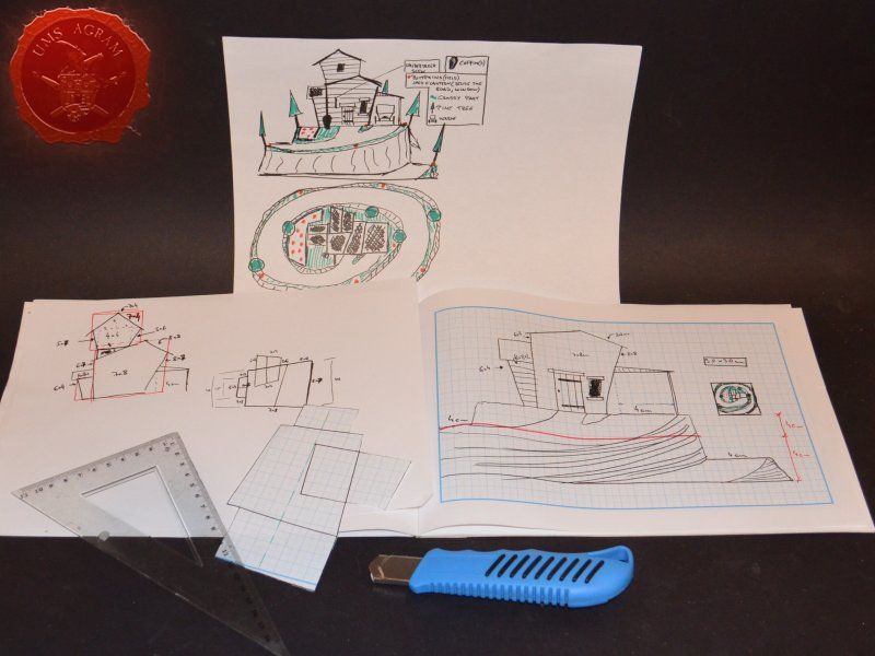
Click for enlarged picture

Materials and tools

After the rough sketch, I could make a definite list of materials and tools needed for this project. Those are as follows:
- one 2x2 mm linden slat
- one 5x5 mm linden slat
- roughly two full planks of 2 mm balsa wood (they come in 10 x 100 cm planks)
- roughly 20cm of 5mm balsa wood (they also come in 10 x 100 cm planks)
- about 0,5m2 of 5cm thick HD styrofoam (50x100cm)
- superglue
- PVA glue
- 0,5 kg of DAS air drying clay
- gravel (four sizes)
- static grass / tufts
- pine trees
- sanding paper (1 sheet)
- thin card
- masking tape
- toothpicks
- some pins
- pumpkins
- jack o'lanterns
- hearse

The tools needed are:
- scalpel blade
- marker pen
- scissors
- modelling saw
- pin vice (or an electric mini drill)
- brushes– various sizes – for painting/washing and for drybrushing
- pliers and pincers
- hot wire cutter

* Unlike June issue of Wyrd Chronicles, where I used my Proxxon disc sander, jigsaw on the MDF to make the base, here I would make the base with styrofoam only. However, if you like a sturdier terrain, you can always cut the MDF base using a jigsaw and sand it down using a disc sander. When your base is cut, just glue the styrofoam base described later to your MDF base.

Building the base

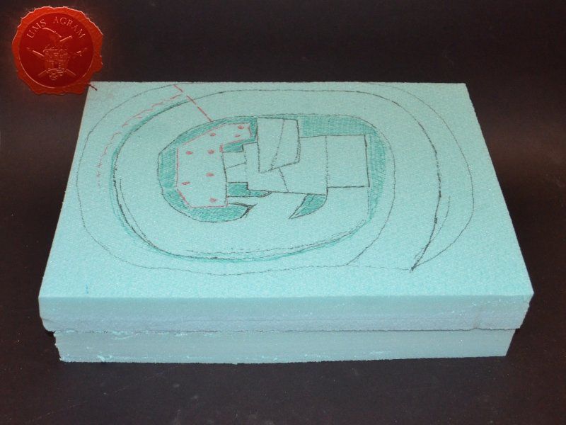
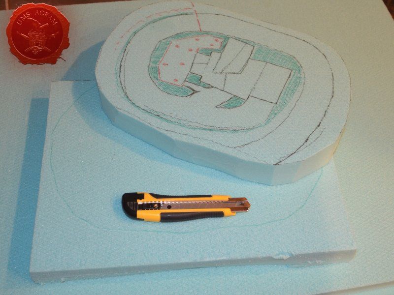
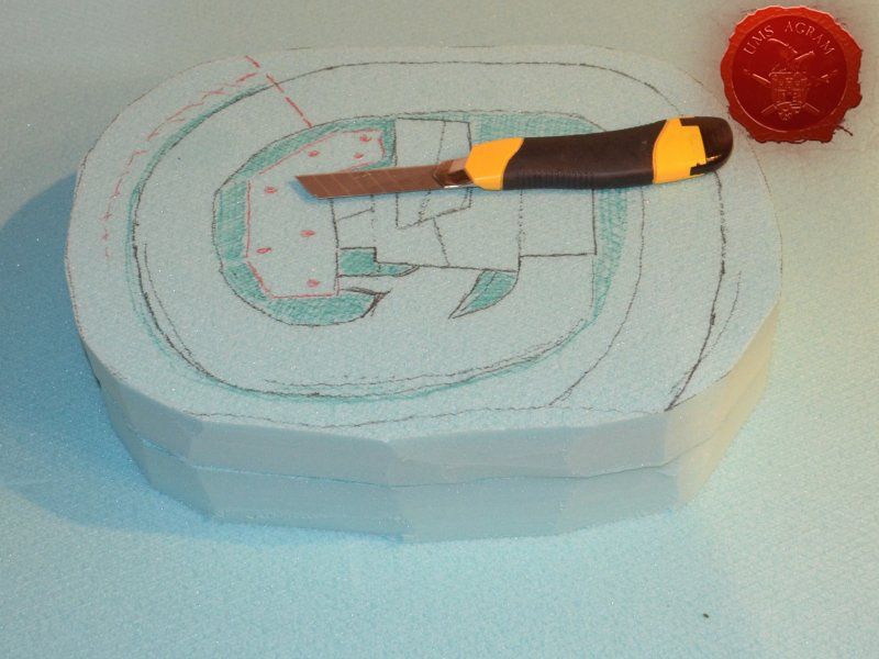
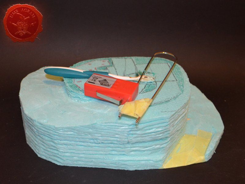
Having all the materials arrive, I cut the footprint of the house that I drew on the graph paper and using a marker pen I used it as a template to drew a rough outline of the house on the HD styrofoam board. Around it, I started drawing trying to copy the design from the paper onto the HD styrofoam board. Once I was satisfied with the layout, I proceeded to cut it with my scalpel blade. Using long strokes with relatively shallow cuts it took me several goes to cut only one piece of styrofoam. Going around the base, I repeated the process untill I cut what would be the whole base of my new terrain. It is important to go with shallow cuts, because if you try with to deep of a cut, you'll end up tearing the styrofoam which looks really messy and would only result in a lot of sanding. This in turn would slow the whole building process. I now had the first layer of my haunted hill. If you remember, I wrote that my hill would be 10cm high. The HD styrofoam being only 5cm thick, meant I had to cut another base of the same size. Using the first base as a template I first drew the outline with a marker pen and then following the same procedure as with the first base, I cut it to size with my scalpel blade.
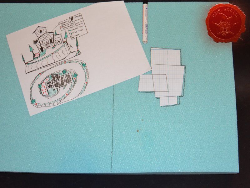
Click for enlarged picture

Click for enlarged picture

Click for enlarged picture

Click for enlarged picture

Click for enlarged picture

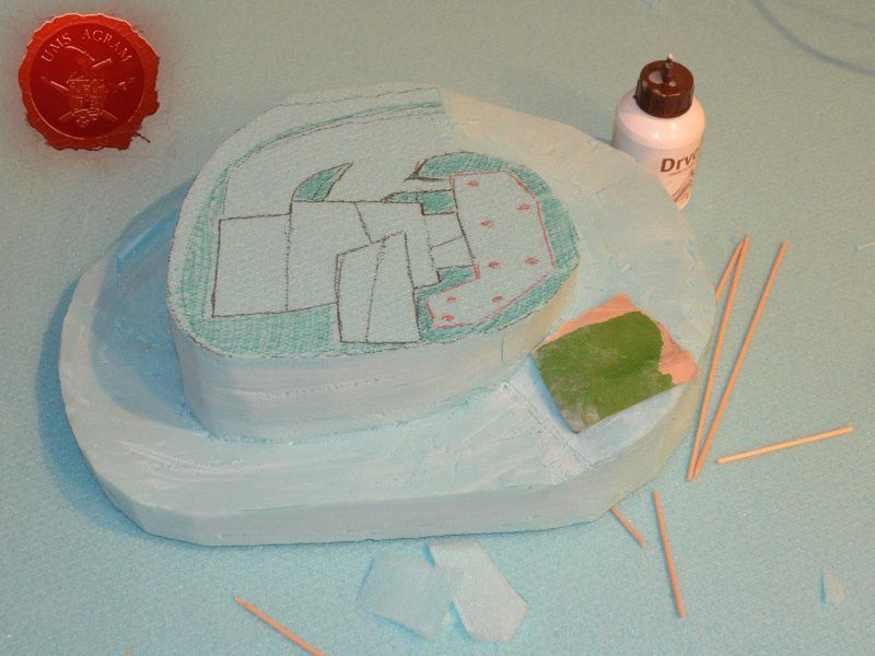
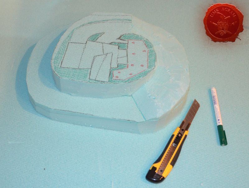
With both halves of the base cut, I had to make the winding road which meant further cutting of both of the bases. Using a marker of another colour, I drew the cut lines and carefully cut the excess styrofoam with my scalpel blade.

NOTE: if you feel that the cutting is getting heavier, change the blade. Unfortunately, styrofoam is murder on the blades and to have a perfect cut, you need sharp blades.

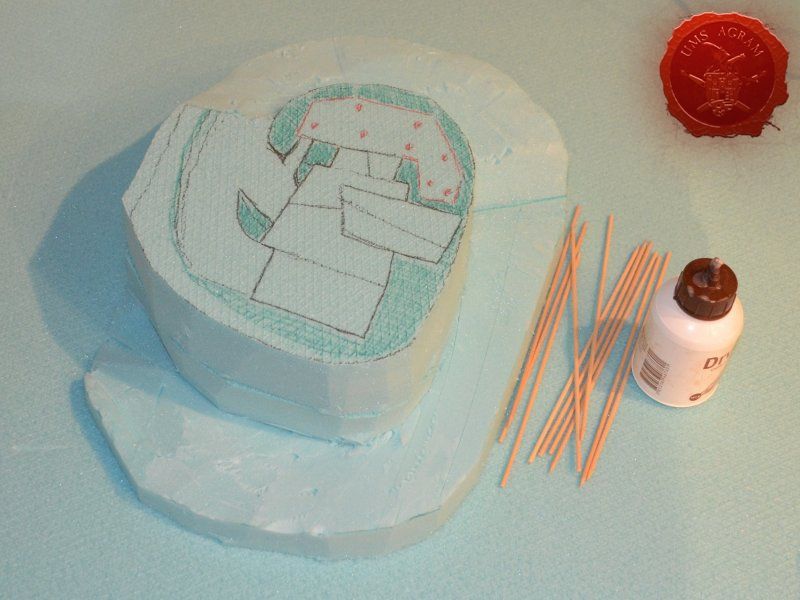
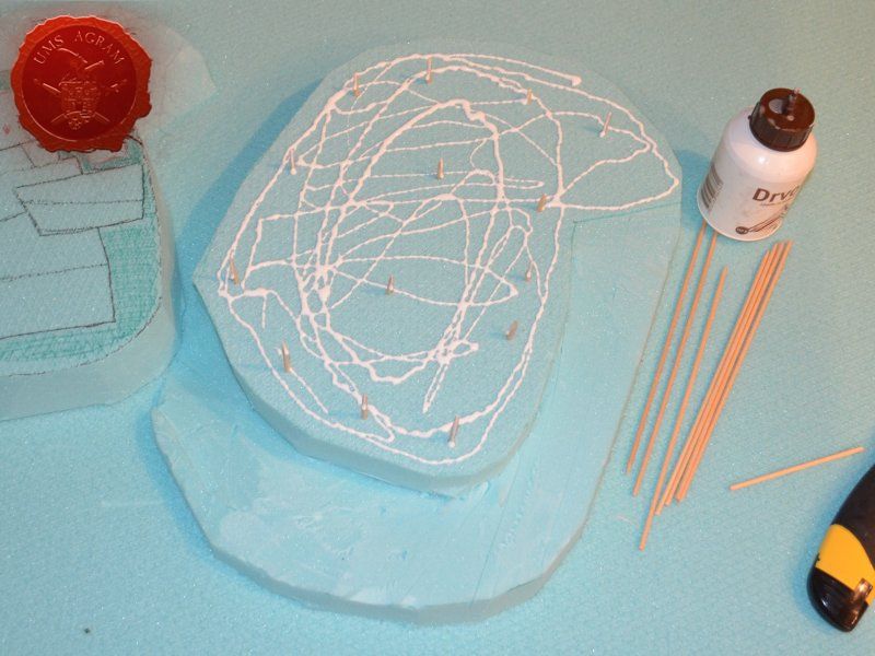
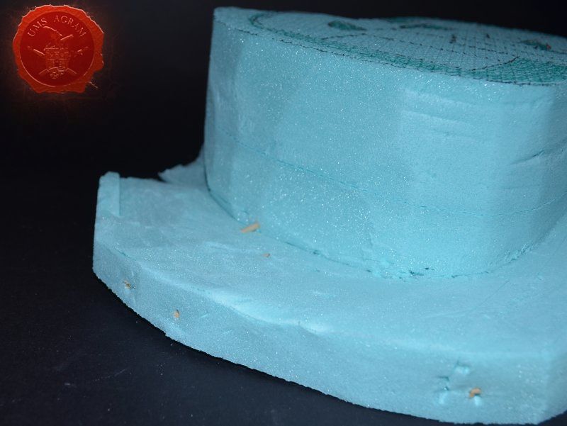
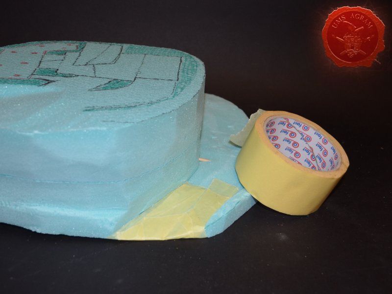
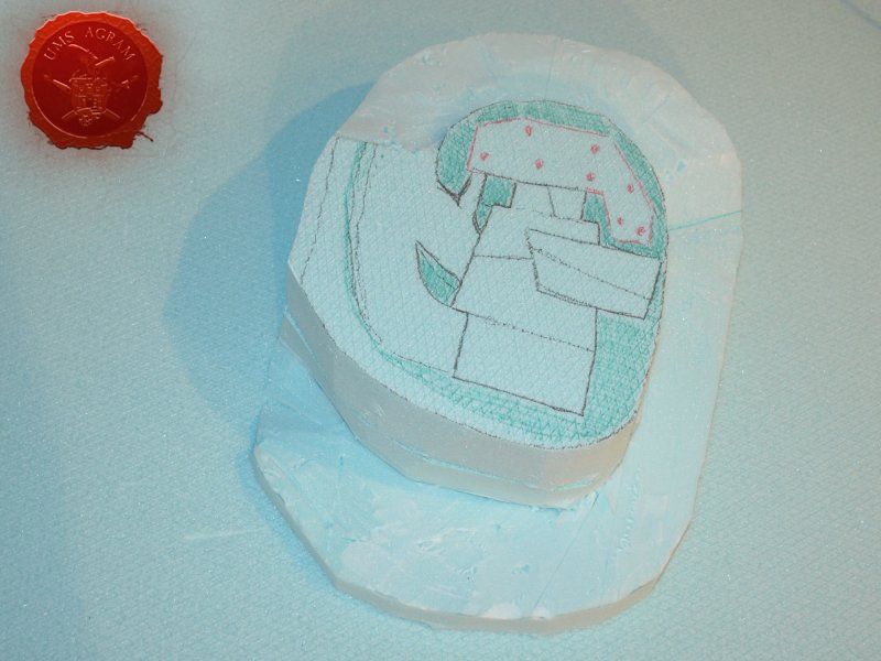
After the cutting was done, I used a piece of sanding paper to smooth out the irregularities left over from the scalpel blade. The two halves were now complete and I had to glue them together. Using skewers to connect the halves I glued them using PVA glue. I also noticed that at the start of the road the styrofoam was really thin so I stuck a whole skewer through the side of the terrain so it wouldn't break. Also, I protected the begining of the road with masking tape.

With the base glued, I now had to cut the cliffs. Same as last time I used my hot wire cutter to model the vertical surfaces. I again used my cheapest wire cutter, powered by two AA batteries. The electricity from the batteries heats up the wire that then melts the styrofoam performing a perfect straight cut. However, as it heats the wire elongates so you should take into account that fact when fixing the wire to the cutter. If the wire is too long, it will still perform the job, however it won't be as handy and you (like me) will have to stoop to some really fiddly and strange handling of the device in order to get a nice cut. After a bit of fiddling I managed to engrave the errosion patterns with the hot wire cutter.
Click for enlarged picture

Click for enlarged picture

Click for enlarged picture

Click for enlarged picture

Click for enlarged picture

Click for enlarged picture

Click for enlarged picture

Click for enlarged picture

Click for enlarged picture

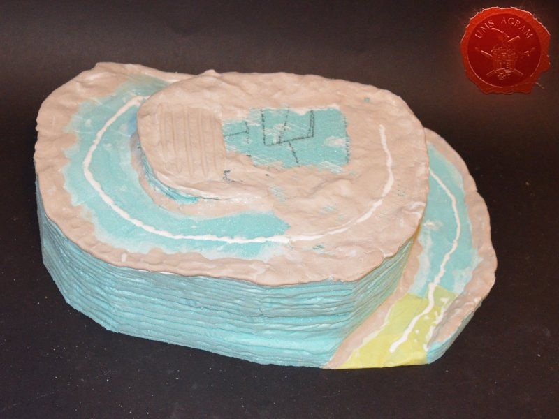
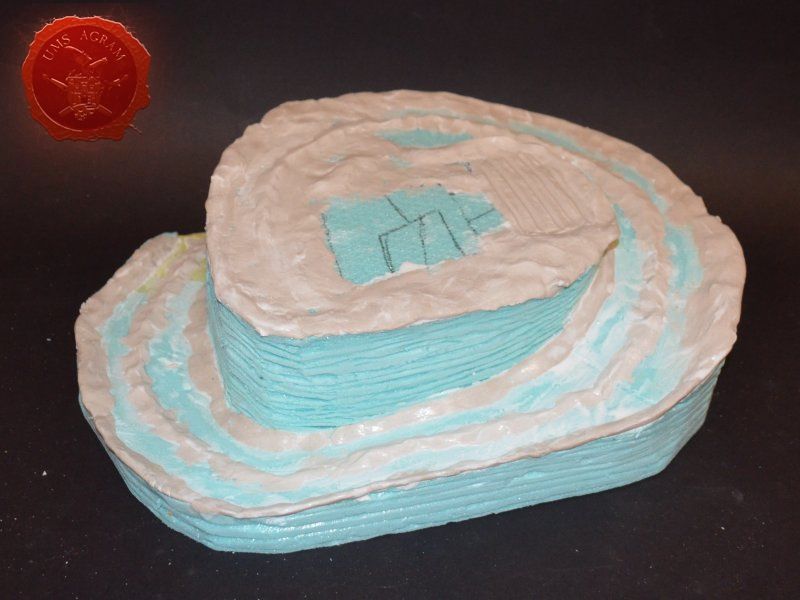
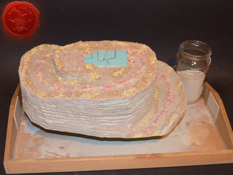
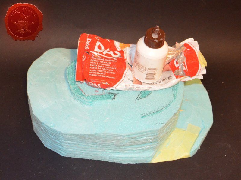
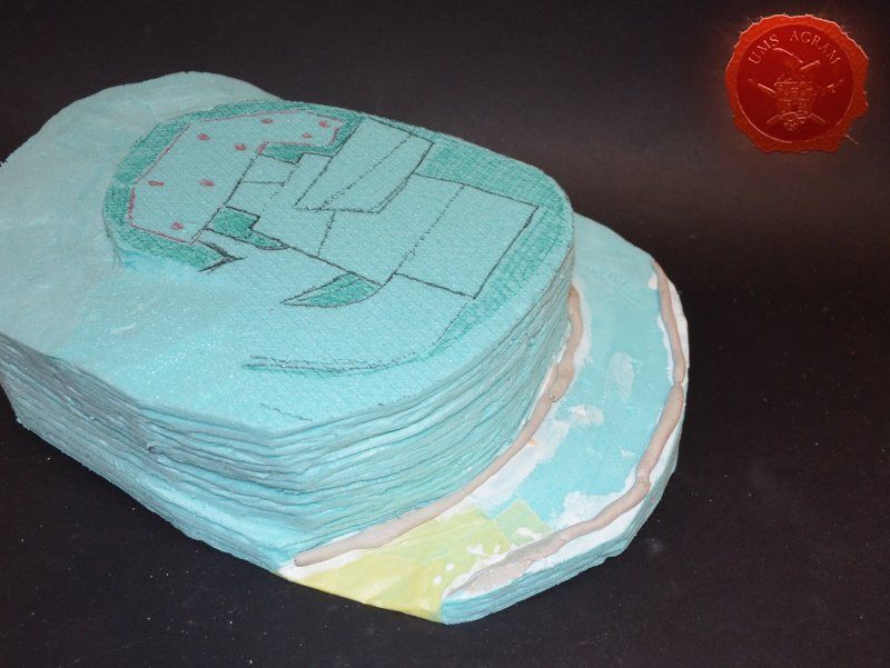
When the hillside was built, it still looked a bit dull and plain so I decided to make some escarpments along the sides of the cliffs. In order to do so, I needed to build up the volume there. I could have done it using HD styrofoam once again, but I opted against it, choosing to sculpt the escarpments using DAS air drying clay. DAS comes in two versions, white and terracota. Both are equally good, don't crack during the curing period and are reasonably good for sculpting. (Note: you won't be able to sculpt your minis with DAS, but you will be able to model brick or stone walls, cobbled streets and whatnot.) I poured some PVA glue and spread some DAS along the inner and outer sides of the winding road. I then added some clay to the upper level of the base. I also added some volume to the middle of the road with DAS clay as well.
Click for enlarged picture

Click for enlarged picture

Click for enlarged picture

Click for enlarged picture

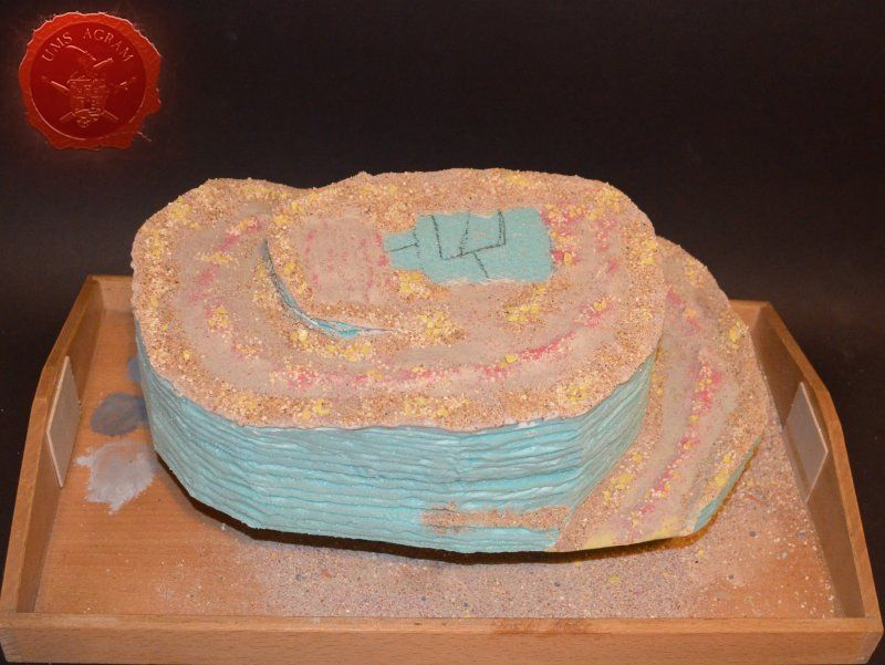
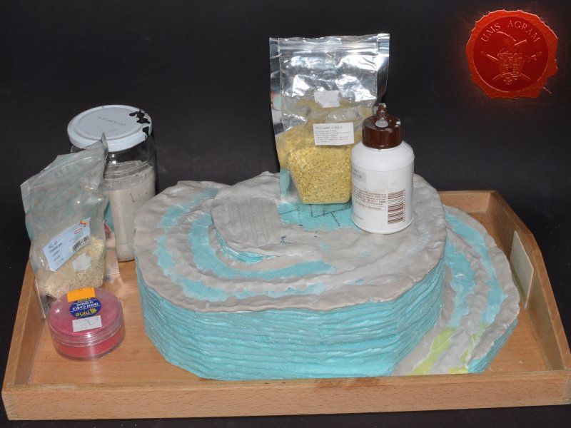
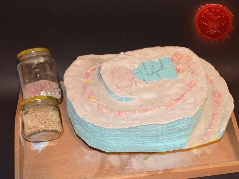
Finally we come to the stage of adding the texture. First, I decided to do the road. Applying a heavy coat of PVA glue, I added some gravel. As always I started with the largest grain and finishing with the smallest grain – sand for chinchillas. I also used the smallest grain on my pumpkin field on top of the base.

The road and field being done, I could now turn to the other horizontal surfaces – mostly the sides of the road. Again, I covered everything with PVA glue and added three or four different types of gravel. The final layer was a bit coaser than chinchilla sand in order to differentiate between the two.

When these were dry, I added pure chinchilla sand to the vertical surfaces of the cliffs. Here I had to make sure the PVA got into the grooves so I diluted the PVA with water in order for it to flow more freely.

I do all my texturing (and flocking for that matter) inside an old trey. This way all the excess material drops into it so I can reuse it later on. Saves money and time on vacuuming.

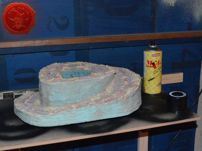
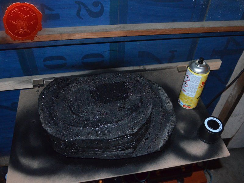
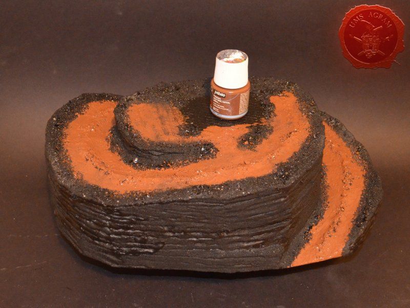
After the texture was dry, I undercoated the base with a black acrylic mat sprey in my garage. Always sprey in a well ventilated area.
Click for enlarged picture

Click for enlarged picture

Click for enlarged picture

Click for enlarged picture

Click for enlarged picture

Click for enlarged picture

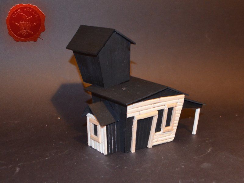
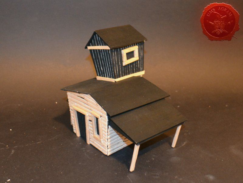
Making the structure

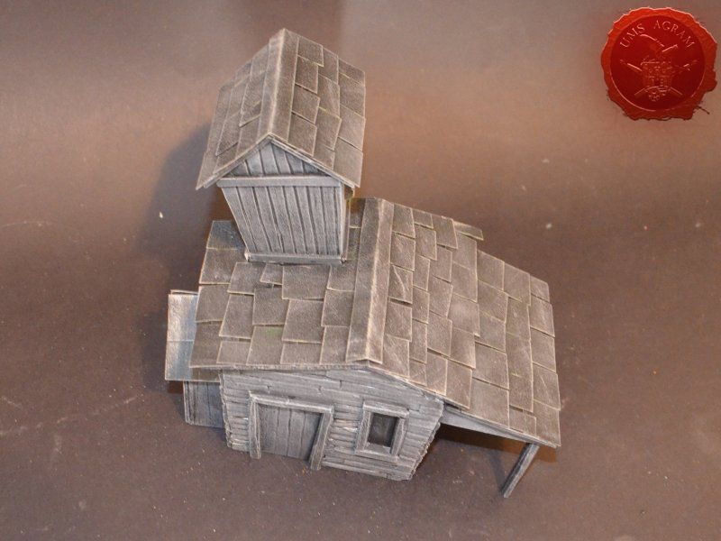
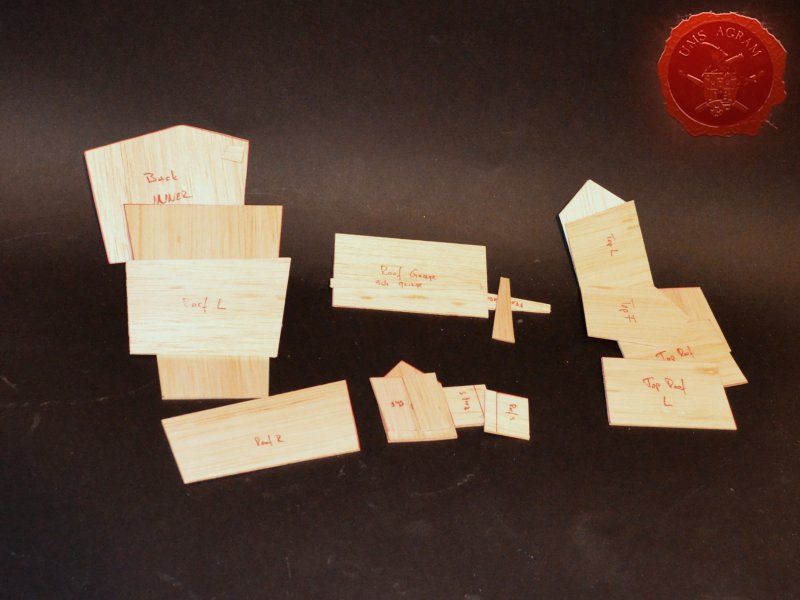
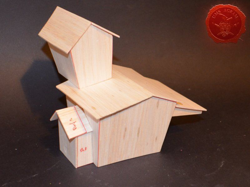
While the texture and undercoat were drying, I proceeded to make the structure of the Undertaker's house. I decided to go for an easier and faster method of building the structure than I used in my old west church build. Unlike the old west church where I first made the wooden frame and then glued each plank separately, here I opted to make the walls from a single piece of 2mm balsa wood. On top of it, I would then glue 2mm thick balsa planks (cca 0,5x3cm). I made sure the wall structure had grooves going in up-down direction while the wall planks were glued going left to right. This way, although the wall is relatively thin, the structure is sturdy enough to withstand gaming abuse without any damage/breakage. As with MDF and styrofoam bases, I first drew the outlines of each wall on the balsa plank using my marker pen. Then I carefully cut each wall. I used my modellers saw for cuts against the grain (perpendicular to it) and used the scalpel blade for cuts going with the grain. When every wall segment was cut, I glued the walls together.

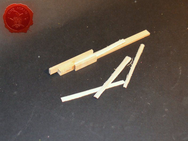
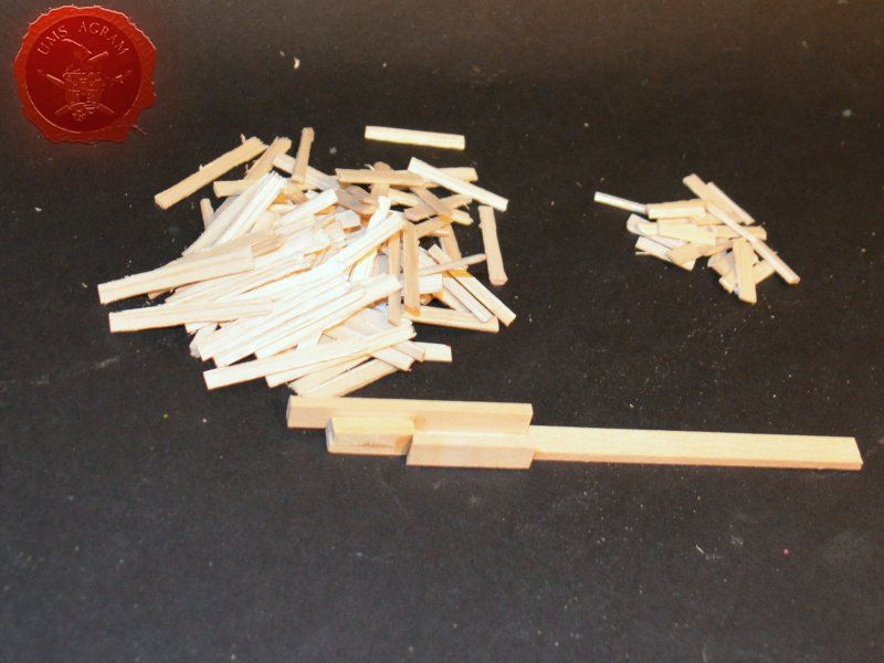
It was now time to cut and model balsa planks. Once again, I used a method similar to the one I used during the old church build. Since I would need a lot of slats of mostly the same size (3cm long) which would require a lot of precise and repeated measuring, I decided to help myself and construct a toos that would be used to cut the slats into desired length - 30 mm long. The geometry of these simple tools would allow fast and precise cutting of the balsa slats and true enough after only half an hour I had cut almost 4 meters of balsa planks.

Once the basic outline of the structure was made, I started gluing the planks. In places where the planks protruded from the walls, I cut them using my scalpel blade. The whole process is fiddly mostly because none of the walls is perpendicular to the other so lots of tayloring was required.

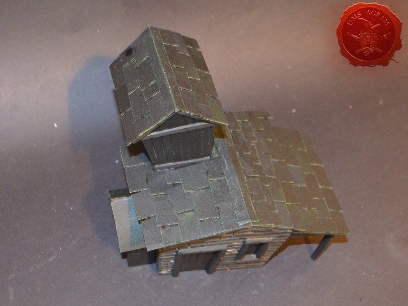
To make the roof structure, I used 2mm thick balsa wood. Once the roof structure was made, I used the same material I used on the church to make the roof – sanding paper cut to size. I just love the texture it has. Once everything was finished, I took both the structure and the base to my garage for a quick sprey of undercoat. Remember to always sprey in a well ventilated area! When the undercoat was dry, I first dryfitted the building to the base, closed the gaps with some balsa planks and applied with a large brush a coat of black colour to the places the sprey didn't reach.
Click for enlarged picture

Click for enlarged picture

Click for enlarged picture

Click for enlarged picture

Click for enlarged picture

Click for enlarged picture

Painting

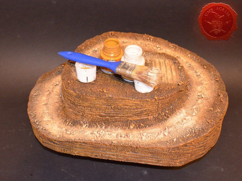
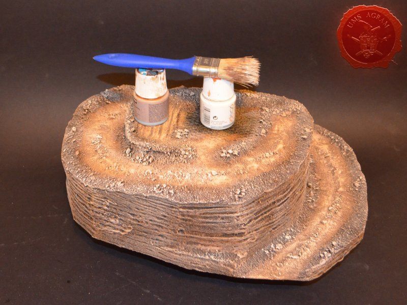
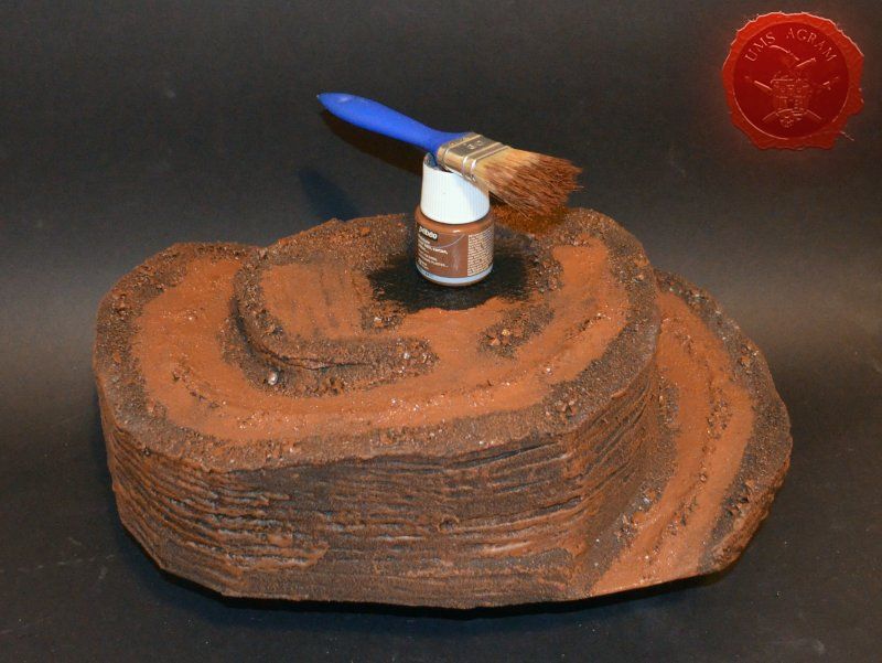
When the undercoat was dry, it was time to paint the terrain. Normally, I would have glued the building to the base at this point but I decided against it mainly because of the site of the terrain itself. This way I could handle the terrain easier so I left the two parts separate. I started painting the base first. Wanting all my terrain to fit one theme (and consequently one tabletop) it was only natural I use the same colours and colour scheme as on the earlier terrain. Therefore once again I used Pebeo Deco color range. I used Brown (29) for the basecoat and continued drybrushing with Ocre (51). Lighter shades were done with a 50:50 mixture of Ocre (51) and White (41). The final highlight was done with Antique White (69). The road was first basecoated with Brown (29) then heavily drybrushed with Ocre (51) and a 50:50 mixture of Ocre (51) and White (41). The last two highlights were Antique White (69) and pure White (41). This way, I had a visual difference between the cliffs with normal groundwork and the worn out road.
Click for enlarged picture

Click for enlarged picture

Click for enlarged picture

Click for enlarged picture

The building has two different surfaces and consequently textures – roof and wooden walls. I proceeded to paint the wooden walls by drybrushing first using a 50:50 mixture of Black (55) and Grey (54). Next layer was pure Grey (54) and the finishing highlight was Ash Brown (70). I was not quite satisfied with the result, so I added another highlight of pure White (41). The roof was painted first with a mixture of Black (55) and Grey (54) and then a mixture of Grey (54) and Antique White (69) finishing with almost a pure coat of Antique White (69). With the base and house painted, I could now glue them together. I used PVA glue to glue the building in place.
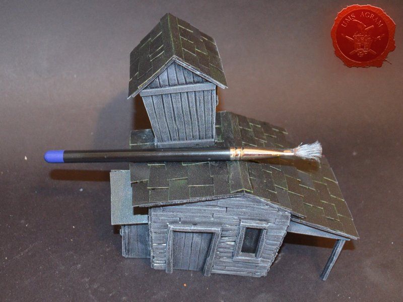
Click for enlarged picture

Click for enlarged picture

Click for enlarged picture

Click for enlarged picture

Vegetation

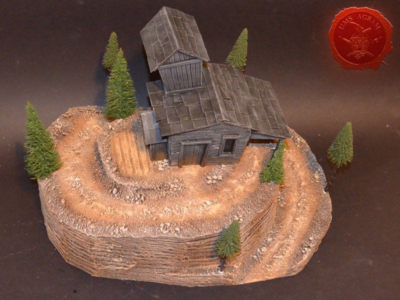
After the painting, it was time to add the vegetation to the base. First up, I decided to plant some pine trees. I used Ziterdes ones that come in a big pack of 20 (or 25, not sure). They come on long shafts and in several sizes and heights. In order to glue them in place, I first had to cut their round bases as they got in the way. I also added metal pins to the pine trees. The easiest method of pinning metal pins to the plastic trunks of the trees is to heat the metal pin using a candle and just stick it into the trunk. The heat will melt the plastic locally and as the pin goes into the trunk the heat dissipates and once the pin is cool it will become lodged into the trunk without any need to glue it. Also, I used a pinvice to make the hole in the DAS clay base to accommodate the pins. I glued the trees using both PVA and super glue.
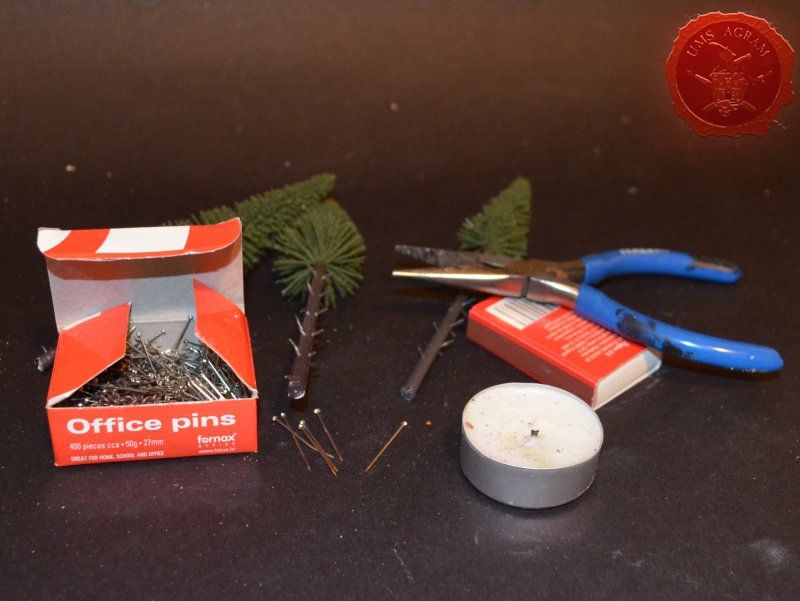
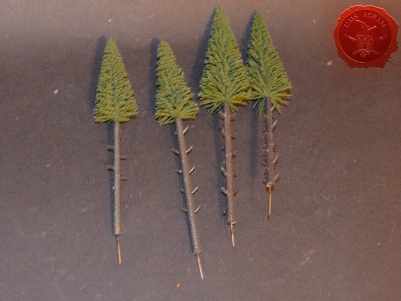
Click for enlarged picture

Click for enlarged picture

Click for enlarged picture

With the trees in place, I could now add the static grass. I made a mixture using several green, brown, yellow and black shades of static grass and when I was satisfied with the end product, I glued it in random patches throughout the base. One thing I made sure of is that I put static grass over any and all of the remaining holes where the wooden structure met the base in order to hide the unintentional mistake. Once the static grass was in place, I applied several shades of different tufts. Again, as in the former articles, I used tufts made by a company called Gamer's Grass.
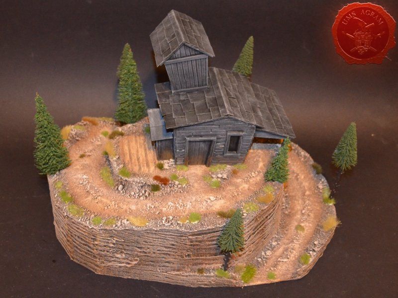
Click for enlarged picture

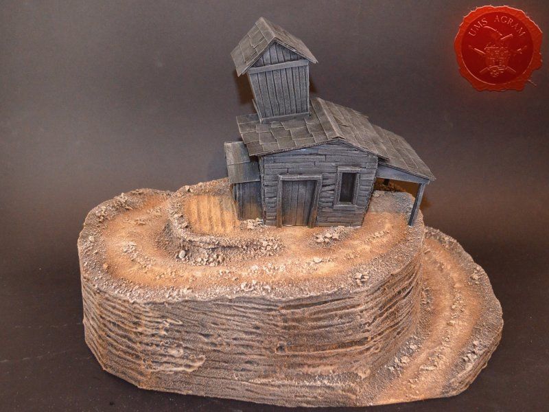
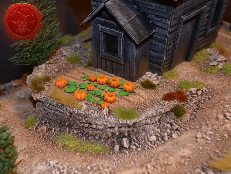
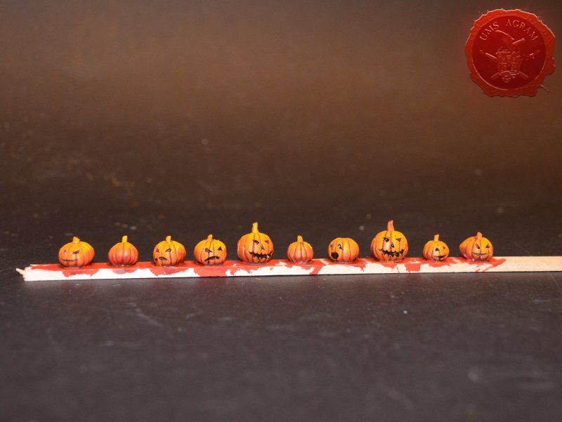
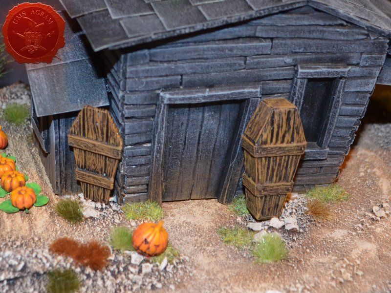
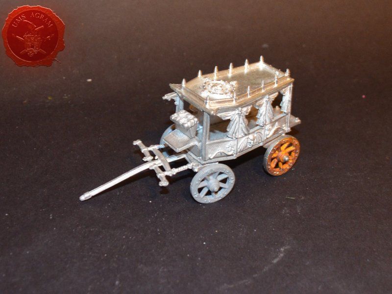
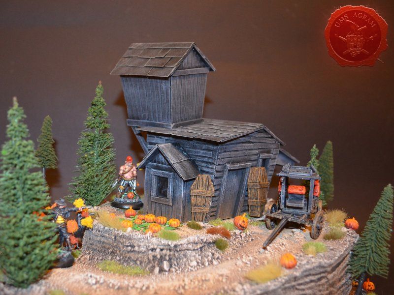
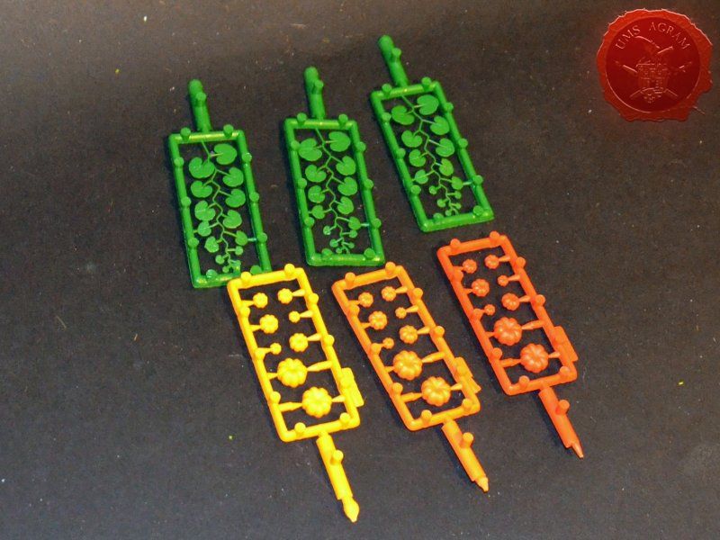
In the end I added my cool Haloween-ey additions. First up was the pumpkin field. Pumpkins come from Busch, a German model train company that produces excellent terrain accessories, especially in their Natur Pur range (pumpkins, sunflowers, roses, water lillies etc). The set cost about 8USD and has 10 sets of pumpkins with vines and I think it's great value for money. Being an H0 scale, these are in a scale a bit smaller than 32mm minis but the pumpkins come in various sizes so you can even use the smallest pumpkins as tomatos. They already come in different colours so painting required was minimal. When the painting was done, I glued the couple of sets into my pumpkin field using superglue. The second addition was a couple of Jack o'lanterns made by Secret Weapon Miniatures. Set costs about 10 USD and has 10 Jack o'lanterns which is also great value for money. They are full of character and come in several sizes and designs. Unlike Busch, they are created for tabletop miniatures in mind so the scale works perfectly. Being grey these required some painting – using reds and oranges with some black lining. Once I was done with the painting, I glued them randomly along the road and in front of the house for some Haloween feeling. The third addition was the coffin and the lid. They come from an English company called Zealot Miniatures. Among other stuff, they produce excellent resin accessories for dungeons (like doors, trap doors, furniture, fountains etc..). In fact, they recently had quite a successful Kickstarter. I painted the grey resing with brown colours. The final addition to the terrain, which I actually left unglued, was the hearse. It was an old GW Black Coach that I had lying around. I built it using superglue and painted it black with some grey highlights. The reason for leaving it unglued was purely because of easier gaming. With it in the shed, it would prevent models from going around the house. This marked the end of the build and all I had to do was to take some pictures of the finished product.
Click for enlarged picture

Click for enlarged picture

Click for enlarged picture

Click for enlarged picture

Click for enlarged picture

Click for enlarged picture

Click for enlarged picture

Click for enlarged picture

Click for enlarged picture

Click for enlarged picture

Click for enlarged picture

Click for enlarged picture

Click for enlarged picture

Click for enlarged picture

Click for enlarged picture

Latest articles

  • Building a display base for Agramers v.2
              array(2) {
      ["Article"]=>
      array(10) {
        ["id"]=>
        string(3) "522"
        ["member_id"]=>
        string(2) "35"
        ["title_eng"]=>
        string(40) "Building a display base for Agramers v.2"
        ["title_hrv"]=>
        string(35) "Izrada scenske baze za Agramere v.2"
        ["mask_eng"]=>
        string(39) "building_a_display_base_for_agramers_v2"
        ["mask_hrv"]=>
        string(34) "izrada_scenske_baze_za_agramere_v2"
        ["content_eng"]=>
        string(11822) "

    In this article, I will briefly describe the process of creating a scene base for Agramer v.2, from idea to creation, painting, adding vegetation, and finally casting the slices.

    Click for enlarged picture

    The first step in the creation is the idea. For this project, it wasn't too difficult for me, because I participated in (creating) how the figures themselves should look. Therefore, I already had them arranged in some groups in my head. Orc, troll and goblin in one; vampire, Frankenstein's monster and werewolf in another; desert Zorro and sheriff; Highland/Scottish Braveheart, dwarf and bard; and forest Robin Hood, Elf Mage and Elf Enchantress. In the end, there remains the gnome and Jack Sparrow who goes to the island. Inside the purchased frame, I placed the figures, and drew the outlines of the terrain.

    Click for enlarged picture

    After that, I added volume to the base using 2 cm and 5 cm thick HD Styrofoam, slowly shaping the final look of the terrain. I also tried out the look with the figures in each iteration.

    Click for enlarged picture

    Click for enlarged picture

    Click for enlarged picture

    Click for enlarged picture

    Once I was happy with the look, I tackled the problem of locking the figures. Since this base is primarily intended for transportation and display at various performances, I wanted the figures to be attached to the base quite firmly, but still be able to be removed from it. From experience, it is best to use magnets for this. They are difficult to attach, or rather glue, to Styrofoam. Therefore, I had to make slots for the figures from balsa, in which I drilled holes for the magnets. When placing them, make sure that all the magnets on the base are facing the same way - so that you can move the figures to other places if necessary. Also, turn the magnets to the opposite side when placing them in the figure bases. The easiest way to do this is to mark the side of the magnet on which you will put the glue.

    Click for enlarged picture

    Click for enlarged picture

    Then, using DAS clay, I created transitions and smoothed out individual parts to make them look natural.

    Click for enlarged picture

    Click for enlarged picture

    The next step was to build the building. I decided on a Burton-esque haunted house design with a turret. I built it out of balsa, cutting each slat individually. I made the roof out of sandpaper sheets.

    Click for enlarged picture

    Click for enlarged picture

    Then I added texture. I used pebbles and sand in several granulations which I glued together using PVA glue. In parallel with this process, I drilled holes for the trees and tested how it worked.

    Click for enlarged picture

    Painting was the next step. As always, I used PEBEO DECO acrylic paints. Black, gray, white, brown, and ochre are the shades I most often use to get a uniform look for my courts.

    Click for enlarged picture

    After painting, it was time for the vegetation. I placed two or three types of 5-7 mm tufts and static grass. In addition, I placed trees that I glued using PVA glue.

    Click for enlarged picture

    Click for enlarged picture

    The last step was pouring the resin for the sea. I use two-component Gedeo Crystal Resin, which I tint with Pebeo Vitrail. First, you need to mix the two resin components well in a volume ratio of 1:2. When it is well mixed, I add Vitrail color drop by drop to the resin until I am satisfied with the tone of the resin. I pour the resin from the container so that it drips over the stick, this way I get rid of air bubbles that are created by mixing.

    Click for enlarged picture

    This completed the creation of the stage base. Below is a short gallery of close-ups of the base with figures.

    Click for enlarged picture

    Click for enlarged picture

    Click for enlarged picture

    Click for enlarged picture

    Click for enlarged picture

    Click for enlarged picture

    Click for enlarged picture

    Click for enlarged picture

    Click for enlarged picture

    " ["content_hrv"]=> string(11860) "

    U ovom članku ću opisati ukratko proces izrade scenske baze za Agramere v.2 od ideje do izrade, bojanja, stavljanja vegetacije i na kraju ulijevanja rezina.

    Click for enlarged picture

    Prvi korak u izradi je ideja. Za ovaj projekt, to mi i nije bilo pretjerano teško, jer sam sudjelovao (osmišljao) kako same figure trebaju izgledati. Samim time, već sam ih u glavi imao posložene u neke grupe. Ork, trol i goblin u jednoj; vampir, Frankensteinovo čudovište i vukodlak u drugoj; pustinjski Zorro i šerifica; highlandski/škotski Braveheart, patuljak i bardica; te šumski Robin Hood, Elf Mage i Elf Enchantress. Na kraju ostaje gnom i Jack Sparrow koji ide na otok. Unutar kupljenog okvira postavio sam figure, i iscrtao obrise terena

    Click for enlarged picture

    Nakon toga, dodavao sam volumen bazi pomoću stirodura debljine 2 cm i 5 cm, polako oblikujući konačan izgled terena. Također u svakoj iteraciji sam i isprobavao izgled sa figurama.

    Click for enlarged picture

    Click for enlarged picture

    Click for enlarged picture

    Click for enlarged picture

    Kada sam bio zadovoljan s izgledom, bacio sam se na problem uglavljivanja figura. S obzirom da je ova baza primarno namijenjena za transport i izlaganje na raznim nastupima, htio sam da figure budu pričvršćene za bazu podosta jako, ali da se i dalje daju maknuti s nje. Za to, iz iskustva, najbolje je koristiti magnete. Njih je teško pričvrstiti, odnosno zalijepiti, za stirodur. Stoga sam morao izraditi utore za figure od balze u koje sam ubušio rupe za magnete. Prilikom postavljanja, pazite da svi magneti na bazi budu okrenuti na istu stranu – tako da možete prema potrebi i pomicati figure na druga mjesta. Također, magnete okrenite na suprotnu stranu kad ih postavljate u baze figura. To je najjednostavnije odraditi tako da označite stranu magneta na koju stavljate ljepilo.

    Click for enlarged picture

    Click for enlarged picture

    Zatim sam koristeći DAS glinamol izradio prelaze i zagladio pojedine dijelove da izgledaju prirodno.

    Click for enlarged picture

    Click for enlarged picture

    Sljedeći korak bila je izrada zgrade. Odlučio sam se za burtonovski dizajn uklete kuće s tornjićem. Izgradio sam ju od balze, svaku letvicu izrezujući zasebno. Krov sam napravio od ploča brusnog papira.

    Click for enlarged picture

    Click for enlarged picture

    Zatim sam dodao teksturu. Koristio sam kamenčiće i pijesak u nekoliko granulacija koje sam zalijepio koristeći PVA ljepilo. Paralelno s tim procesom, izbušio sam rupe za drveće i isprobao kako funkcionira.

    Click for enlarged picture

    Bojanje je bio sljedeći korak. Kao i uvijek koristio sam PEBEO DECO akrilne boje. Crna, siva, bijela, šmeđa i oker su nijanse koje najčešće koristim da dobijem uniforman izgled svojih terena.

    Click for enlarged picture

    Nakon bojanja došao je red na vegetaciju. Postavio sam dvije, tri vrste 5-7 mm tuftova i statičku travu. Pored toga, postavio sam i drveće koje sam zalijepio koristeći PVA ljepilo.

    Click for enlarged picture

    Click for enlarged picture

    Zadnji korak bio je ulijevanje rezina za more. Koristim dvokomponentni Gedeo Crystal Resin kojeg obojim Pebeo Vitrail bojom. Prvo je potrebno dobro umiješati dvije komponente rezina u volumnom omjeru 1:2. Kada je dobro umiješan, u rezin dodajem kap po kap Vitrail boje dok nisam zadovoljan tonom rezina. Rezin ulijevam iz posude da curi preko štapića, na taj način rješavam se balončića zraka koji nastaju miješanjem.

    Click for enlarged picture

    Time je završila izrada scenske baze. U nastavku slijedi kratka galerija krupnih planova baze sa figurama.

    Click for enlarged picture

    Click for enlarged picture

    Click for enlarged picture

    Click for enlarged picture

    Click for enlarged picture

    Click for enlarged picture

    Click for enlarged picture

    Click for enlarged picture

    Click for enlarged picture

    " ["created"]=> string(19) "2026-07-15 09:34:03" ["modified"]=> string(19) "2026-07-15 09:34:03" } ["Member"]=> array(10) { ["id"]=> string(2) "35" ["group_id"]=> string(1) "1" ["first_name"]=> string(5) "Marko" ["last_name"]=> string(9) "Paunović" ["first_name_mask"]=> string(5) "marko" ["last_name_mask"]=> string(8) "paunovic" ["username"]=> string(5) "marko" ["password"]=> string(40) "3bd37b326d19d1880d3b93a4b32e8fb3a90fa122" ["born"]=> string(19) "2033-03-07 20:35:00" ["created"]=> string(19) "2009-06-02 20:37:03" } }
    Marko Paunović, 15th July 2026
  • Pigmentation principles: Binders and solvents - what holds the paint in place and what allows it to flow
              array(2) {
      ["Article"]=>
      array(10) {
        ["id"]=>
        string(3) "521"
        ["member_id"]=>
        string(3) "108"
        ["title_eng"]=>
        string(105) "Pigmentation principles: Binders and solvents - what holds the paint in place and what allows it to flow "
        ["title_hrv"]=>
        string(98) "Principi pigmentacije: Veziva i otapala - što drži boju na mjestu i što joj omogućuje da teče"
        ["mask_eng"]=>
        string(103) "pigmentation_principles_binders_and_solvents_-_what_holds_the_paint_in_place_and_what_allows_it_to_flow"
        ["mask_hrv"]=>
        string(92) "principi_pigmentacije_veziva_i_otapala_-_sto_drzi_boju_na_mjestu_i_sto_joj_omogucuje_da_tece"
        ["content_eng"]=>
        string(9820) "

    So far in this series, we've written about the visible and tangible properties of paint — why paint has a certain shade, why it covers or doesn't cover, why it flows more easily or more slowly. This article is about what lies beneath it all: binders and solvents, the components that determine what remains on the surface when everything else evaporates.

    Click for enlarged picture

    1. What is a binder and what is its role

    A binder is a component of paint that holds pigment and filler particles together and ensures their adhesion to the substrate. When the paint dries or sets, the binder forms a continuous film that encapsulates the pigment and protects it from mechanical and chemical influences. The binder determines most of the application properties of the finished paint: film flexibility, hardness, gloss, chemical resistance, adhesion and durability. Two coatings with the same pigment but different binders can behave completely differently — one may be flexible and waterproof, the other brittle and sensitive to moisture.

    2. How a binder works — film formation

    Depending on the type of binder, the film is formed in one of two basic ways:
    • Physical drying
    • Chemical crosslinking (polymerization) Acrylics technically undergo physical drying — water evaporates, and acrylic polymer particles combine into a film through a process called coalescence.

    Once formed, the acrylic film is chemically stable and practically insoluble in water, but soluble in some organic solvents.

    Click for enlarged picture

    3. Types of binders

    Acrylic binders

    Acrylic binders are synthetic polymers dispersed in water (latex). They are the most widely used in modern use — they are used in acrylic paints for miniatures, wall paints, primers and varnishes. Characteristics:
    • Water is the solvent — easy cleanup, low toxicity
    • Fast drying — an advantage for working in layers, a disadvantage for wet-on-wet techniques
    • Flexible and waterproof film after drying
    • The color changes slightly when drying — acrylics are known to darken as they dry (due to a change in the refractive index of the binder)

    Oil binders

    Oil paints use drying oils as a binder — most often linseed oil, but also walnut, poppy and safflower. Each oil has slightly different properties: linseed oil dries the fastest and gives a strong film, but it can turn yellow over time; poppy and safflower oils are less yellow but dry more slowly. Features:
    • Drying by oxidative polymerization — slow (hours to days), but the film is extremely durable
    • Long open time — ideal for wet-on-wet techniques and mixing on the palette
    • Rich, deep gloss that acrylics have difficulty reproducing
    • Solvents are organic — mineral organic solvents (white spirit, xylene, etc.)
    • Some pigments in oil-based paints can yellow over time due to the binder

    Alkyd binders

    Alkyds are synthetic polymers based on oils and acids — a kind of modernization of oil binders. They dry by oxidative polymerization like oils, but faster and with more predictable properties. They are common in industrial coatings, primers, and decorative paints for metal and wood. Characteristics:
    • Faster drying than pure oils, but slower than acrylics
    • Hard and resistant film — good chemical and mechanical resistance
    • Solvents are organic — mineral organic solvents (white spirit, xylene, etc.)
    • May turn yellow over time, similar to oil binders

    Gum arabic and other water-soluble binders

    Gum arabic is a natural resin used as a binder in watercolors and some inks. It is soluble in water and dries by physical drying — the film remains soluble in water even after drying, which is a characteristic of watercolors (possibility of reactivation). In the same category of water-soluble binders are casein (from milk), egg tempera (egg yolk as an emulsion of oil and water) and gouache binders. Each of them gives a different film with different properties.

    Click for enlarged picture

    4. What are solvents and what is their role

    A solvent is a substance that dissolves or disperses a binder, thereby controlling the viscosity of the paint, enabling its application, and determining the drying speed. After application, the solvent evaporates — and this evaporation process is actually the first stage of “drying” the paint. It is important to distinguish a solvent from a thinner. A true solvent dissolves the binder — it molecularly breaks it down and homogeneously incorporates it into the solution. A thinner only lowers the viscosity, but does not necessarily dissolve the binder. In practice, these terms are often used interchangeably, but the difference becomes important when talking about compatibility.

    5. Types of Solvents

    Water

    Water is a solvent for acrylic binders, gum arabic, and other water-soluble binders. The advantages are low toxicity, no flammability, and easy cleanup. Disadvantages include relatively slow evaporation compared to organic solvents and sensitivity to temperature and humidity — drying is significantly slowed down at low temperatures or high humidity.

    Turpentine and mineral organic solvents

    Turpentine is a natural distillate of coniferous resin and a traditional solvent for oil paints and alkyds. It has a characteristic odor and good solvating effect. Due to its strong odor and potential toxicity with prolonged exposure, in modern use it is increasingly being replaced by mineral organic solvents (white spirit, xylene, etc.) or odorless isoparaffin-based thinners. Mineral organic solvents are a fraction of petroleum with a slightly milder odor than turpentine, but similar properties. Odorless thinners are more refined and have minimal odor — more suitable for indoor use.

    Isopropanol and ethanol

    Alcohols are used as solvents for some types of inks, varnishes, and shellacs. Isopropanol (IPA) is widely available and is used for cleaning brushes, thinning alcohol-based inks, and various technical applications. It is not compatible with acrylic binders in large quantities — it can destabilize the emulsion.

    6. Binder-solvent interaction

    Each binder has its own compatible solvents — those that dissolve or disperse it properly. Using an incompatible solvent can lead to: • coagulation — the binder precipitates out of solution in the form of lumps • emulsion destabilization — the paint separates into phases • poor film formation — the paint does not bond properly, remains sticky, or peels • dissolution of previously applied layers — especially a problem with varnishes and topcoats A practical example: acrylic paints are water-based. Adding mineral spirits or turpentine to acrylic paint will not thin it — it will cause the binder to coagulate and destroy the paint. Conversely, adding water to oil paint does not thin it properly — water and oil do not mix.

    7. Media, additives and retarders

    Media are formulated additives that modify the properties of the paint without disturbing the ratio of the components. For acrylic paints, these can be: drying retarders (retarders) that extend the open time and enable wet-on-wet techniques, liquid media that lower viscosity while maintaining gloss, matte media that reduce gloss, or glaze media that increase transparency. For oil paints, the media can be: varnish (damar, mastic) which accelerates drying and gives shine, siccatives (driers) which chemically accelerate oxidative polymerization, but whose excessive use can cause the film to crack over time. General rule: media are formulated for specific binders and should not be used interchangeably. Acrylic paint medium will not work in oil paint and vice versa.

    Conclusion

    The binder is what makes the pigment and solvent into paint — it forms a film, holds the pigment to the substrate, and determines the durability of the coating. The solvent controls the viscosity and drying speed, but it must be compatible with the binder. Understanding this trio — pigment, binder, solvent — provides a solid foundation for understanding almost any paint or coating you will work with.

    " ["content_hrv"]=> string(9708) "

    Dosad smo u ovoj seriji pisali o vidljivim i opipljivim svojstvima boje — o tome zašto boja ima određenu nijansu, zašto pokriva ili ne pokriva, zašto teče lakše ili teže. Ovaj tekst bavi se onim što je ispod svega toga: vezivima i otapalima, komponentama koje određuju što ostaje na podlozi kad sve ostalo ispari.

    Click for enlarged picture

    1. Što je vezivo i koja mu je uloga

    Vezivo je komponenta boje koja drži čestice pigmenta i punila zajedno i osigurava njihovo prianjanje na podlogu. Kada boja osuši ili veže, vezivo formira kontinuirani film koji enkapsulira pigment i štiti ga od mehaničkih i kemijskih utjecaja. Vezivo određuje većinu uporabnih svojstava gotove boje: fleksibilnost filma, tvrdoću, sjaj, kemijsku otpornost, adheziju i trajnost. Dva premaza s istim pigmentom ali različitim vezivima mogu se ponašati potpuno drukčije — jedan može biti fleksibilan i vodootporan, drugi krhak i osjetljiv na vlagu.

    2. Kako vezivo funkcionira — formiranje filma

    Ovisno o vrsti veziva, film se formira na jedan od dva osnovna načina:
    • Fizikalno sušenje
    • Kemijsko umrežavanje (polimerizacija) Akrili tehnički prolaze kroz fizikalno sušenje — voda isparava, a čestice akrilnog polimera se spajaju u film procesom koji se zove koalescencija.

    Jednom formirani akrilni film je kemijski stabilan i praktično neotopiv u vodi, ali topiv u nekim organskim otapalima.

    Click for enlarged picture

    3. Vrste veziva

    Akrilna veziva

    Akrilna veziva su sintetički polimeri dispergirani u vodi (lateks). Najrasprostranjenija su u suvremenoj upotrebi — koriste se u akrilnim bojama za minijature, zidnim bojama, temeljnim premazima i lakovima. Karakteristike: • Otapalo je voda — lako čišćenje, niska toksičnost • Brzo sušenje — prednost za rad u slojevima, mana za tehnike mokro-na-mokro • Fleksibilan i vodootporan film nakon sušenja • Boja se lagano mijenja pri sušenju — akrili su poznatih po tome da tamne dok se suše (zbog promjene indeksa refrakcije veziva)

    Uljana veziva

    Uljane boje koriste sušiva ulja kao vezivo — najčešće laneno ulje, ali i orašasto, makovo i saflorovo. Svako ulje ima nešto drugačija svojstva: laneno ulje suši najbrže i daje čvrst film, ali može s vremenom požutjeti; makovo i saflorovo ulje manje žute ali sporije suše. Karakteristike:
    • Sušenje oksidativnom polimerizacijom — sporo (sati do dani), ali film je iznimno trajan
    • Dugo otvoreno vrijeme — idealno za mokro-na-mokro tehnike i miješanje na paleti
    • Bogat, duboki sjaj koji akrili teško reproduciraju • Otapala su organska — mineralna organska otapala (white spirit, ksilen i sl.)
    • Neki pigmenti u uljanoj bazi mogu požutjeti s vremenom zbog veziva

    Alkidna veziva

    Alkidi su sintetički polimeri na bazi ulja i kiselina — svojevrsna modernizacija uljanih veziva. Suše oksidativnom polimerizacijom kao i ulja, ali brže i s predvidljivijim svojstvima. Česti su u industrijskim premazima, temeljnim bojama i dekorativnim bojama za metal i drvo. Karakteristike:
    • Brže sušenje od čistih ulja, ali sporije od akrila
    • Tvrd i otporan film — dobra kemijska i mehanička otpornost
    • Otapala su organska — mineralna organska otapala (white spirit, ksilen i sl.)
    • Mogu žutjeti s vremenom, slično uljanim vezivima

    Guma arabika i druga vodotopiva veziva

    Guma arabika je prirodna smola koja se koristi kao vezivo u akvarelima i nekim tintama. Topiva je u vodi i suši fizikalnim sušenjem — film ostaje topiv u vodi i nakon sušenja, što je karakteristika akvarela (mogućnost reaktiviranja). U istoj kategoriji vodotopivih veziva nalaze se i kazein (iz mlijeka), jajčana tempera (žumanjak jajeta kao emulzija ulja i vode) i gvaš veziva. Svako od njih daje drukčiji film s drukčijim svojstvima.

    Click for enlarged picture

    4. Što su otapala i koja je njihova uloga

    Otapalo je tvar koja otapa ili dispergira vezivo i time kontrolira viskoznost boje, omogućuje njezino nanošenje i određuje brzinu sušenja. Nakon nanošenja, otapalo isparava — i taj proces isparavanja je zapravo “sušenje” boje u prvoj fazi. Važno je razlikovati otapalo od razrjeđivača. Pravo otapalo otapa vezivo — molekularno ga razgrađuje i homogeno uključuje u otopinu. Razrjeđivač samo snižava viskoznost, ali ne mora nužno otapati vezivo. U praksi se ovi pojmovi često koriste naizmjenično, ali razlika postaje važna kad se govori o kompatibilnosti.

    5. Vrste otapala

    Voda

    Voda je otapalo za akrilna veziva, gumu arabiku i ostala vodotopiva veziva. Prednosti su niska toksičnost, nema zapaljivosti i lako čišćenje. Mane su relativno sporo isparavanje u usporedbi s organskim otapalima i osjetljivost na temperaturu i vlagu — pri niskim temperaturama ili visokoj vlazi sušenje se znatno usporava.

    Terpentin i mineralna organska otapala

    Terpentin je prirodni destilat smole četinjača i tradicionalno otapalo za uljane boje i alkide. Ima karakterističan miris i dobar solvatacijski učinak. Zbog jakog mirisa i potencijalne toksičnosti pri dugotrajnoj izložnosti, u modernoj upotrebi ga sve više zamjenjuju mineralna organska otapala (white spirit, ksilen i sl.) ili bezmirisni razrjeđivači na bazi izoparafina. Mineralna organska otapala su frakcija nafte s nešto blažim mirisom od terpentina, ali sličnim svojstvima. Bezorisni razrjeđivači su rafiniraniji i imaju minimalan miris — prikladniji za zatvorene prostore.

    Izopropanol i etanol

    Alkoholi se koriste kao otapala za neke vrste tinta, lakova i shellaca. Izopropanol (IPA) je široko dostupan i koristi se za čišćenje kistova, razrjeđivanje alkoholnih tinta i raznih tehničkih primjena. Nije kompatibilan s akrilnim vezivima u većim količinama — može destabilizirati emulziju.

    6. Interakcija veziva i otapala

    Svako vezivo ima svoja kompatibilna otapala — ona koja ga pravilno otapaju ili dispergiraju. Upotreba nekompatibilnog otapala može dovesti do: • koagulacije — vezivo se izlučuje iz otopine u obliku grudica • destabilizacije emulzije — boja se razdvaja na faze • lošeg formiranja filma — boja ne veže pravilno, ostaje ljepljiva ili se lupa • otapanja već nanesenih slojeva — posebno problem kod lakova i finalnih premaza Praktični primjer: akrilne boje su na bazi vode. Dodavanje mineralnog terpentina ili terpentina u akrilnu boju neće je razrijediti — izazvat će koagulaciju veziva i uništiti boju. Obrnuto, dodavanje vode u uljanu boju ne razrjeđuje je pravilno — voda i ulje se ne miješaju.

    7. Mediji, aditivi i retarderi

    Mediji su formulirani dodaci koji modificiraju svojstva boje bez narušavanja omjera komponenti. Za akrilne boje to mogu biti: usporivači sušenja (retarteri) koji produljuju otvoreno vrijeme i omogućuju mokro-na-mokro tehnike, tekući mediji koji snižavaju viskoznost uz zadržavanje sjaja, mat mediji koji smanjuju sjaj, ili glazurni mediji koji povećavaju transparentnost. Za uljane boje mediji mogu biti: lak (damar, mastic) koji ubrzava sušenje i daje sjaj, sikativi (sušila) koji kemijski ubrzavaju oksidativnu polimerizaciju, ali čija prekomjerna upotreba može izazvati pucanje filma s vremenom. Opće pravilo: mediji su formulirani za konkretna veziva i ne smiju se koristiti naizmjenično. Medij za akrilne boje neće funkcionirati u uljanoj boji i obrnuto.

    Zaključak

    Vezivo je ono što od pigmenta i otapala pravi boju — ono formira film, drži pigment na podlozi i određuje trajnost premaza. Otapalo kontrolira viskoznost i brzinu sušenja, ali mora biti kompatibilno s vezivom. Razumijevanje ove trojke — pigment, vezivo, otapalo — daje solidan temelj za razumijevanje gotovo svake boje ili premaza s kojim ćete raditi.

    " ["created"]=> string(19) "2026-07-13 07:51:53" ["modified"]=> string(19) "2026-07-13 07:51:53" } ["Member"]=> array(10) { ["id"]=> string(3) "108" ["group_id"]=> string(1) "2" ["first_name"]=> string(5) "Dunja" ["last_name"]=> string(6) "Singer" ["first_name_mask"]=> string(5) "dunja" ["last_name_mask"]=> string(6) "singer" ["username"]=> string(5) "Dunja" ["password"]=> string(40) "772414a5d6b32309f32f46e9009f1e550809c62d" ["born"]=> string(19) "2006-01-01 00:00:00" ["created"]=> NULL } }
    Dunja Singer, 13th July 2026
  • Pigmentation principles: Density, viscosity and opacity - three different things we call the same name
              array(2) {
      ["Article"]=>
      array(10) {
        ["id"]=>
        string(3) "520"
        ["member_id"]=>
        string(3) "108"
        ["title_eng"]=>
        string(102) "Pigmentation principles: Density, viscosity and opacity - three different things we call the same name"
        ["title_hrv"]=>
        string(105) "Principi pigmentacije: Gustoća, viskoznost i pokrivnost - tri različite stvari koje zovemo istim imenom"
        ["mask_eng"]=>
        string(100) "pigmentation_principles_density_viscosity_and_opacity_-_three_different_things_we_call_the_same_name"
        ["mask_hrv"]=>
        string(101) "principi_pigmentacije_gustoca_viskoznost_i_pokrivnost_-_tri_razlicite_stvari_koje_zovemo_istim_imenom"
        ["content_eng"]=>
        string(7424) "

    In discussions about paints, coatings and various masses, one often hears: this paint is thick; — and this can mean three completely different properties. This text explains what each of them actually means, why it is important to distinguish between them and how this difference affects practical decisions such as thinning the paint.

    Click for enlarged picture

    1. Density — how much material is in a given volume

    Density is a physical property that describes the mass of a material per unit volume. It is measured in grams per milliliter (g/ml) or kilograms per liter (kg/l). Water has a density of about 1 g/ml; metals are much denser, oils somewhat less. Density is a property of a material — it does not change when you stir it, heat it, or cool it. A paint with a density of 1.4 g/ml remains that density whether you stir it with a spoon or let it sit. In the context of paints and coatings, density depends on the composition of the formulation — how much pigment, filler, binder, and solvent is in it. A high density by itself does not tell you anything about how the paint will behave when applied. A good example of the difference between density and viscosity: a salt solution is denser than pure water and sinks, but flows almost as easily. Silicone oil or motor oil, on the other hand, floats on water because it is less dense — yet it is extremely viscous and difficult to flow. Density and viscosity are therefore not the same, nor do they necessarily go together.

    2. Viscosity — resistance to flow

    Viscosity is a rheological property that describes the resistance of a fluid to flow. Honey has a high viscosity — it flows slowly and resists mixing. Water has a low viscosity — it flows easily and without resistance. Viscosity is measured in mPa·s (millipascal-seconds) or cP (centipoise). A key difference from density: viscosity can change without changing the composition of the material. The same material can have different viscosities depending on:
    • temperature — when heated, viscosity decreases (honey flows much more easily at 40°C than at room temperature)
    • shear force — many paints and coatings are so-called pseudoplastic fluids: their viscosity drops when mixed, and returns when at rest (thixotropy)
    • addition of thinner — but this is already an intervention in the formulation, not just a physical correction When someone says that the paint is “too thick to apply,” they are almost always talking about viscosity — about it being difficult to spread or not getting into details. It is not the same as density.

    Click for enlarged picture

    3. Opacity — an optical property, not a physical one

    Opacity and pigmentation have no direct relationship to viscosity or density. Paint can be thin (low viscosity) and have excellent coverage/pigmentation, or thick (high viscosity) and be completely transparent — viscosity and coverage/pigmentation are independent quantities. A good example is ink: they are low viscosity, but can be extremely pigmented and opaque. A wash is a low viscosity, low pigmentation paint — intentionally formulated that way. Craft paints that are sold cheaply in department stores are often the opposite: high viscosity, but low pigmentation. As described in more detail in the previous article in this series, coverage and pigmentation depend on the refractive index and pigment dispersion — not on how “thick” the paint is.

    4. Why these three terms are confused — and why it’s a problem

    In everyday speech, all three are summed up in one word: “thick.” We say that a paint is thick when we mean that it is viscous, opaque, and pigment-rich — all at once. In practice, this works until problems arise. Typical confusion: the paint is viscous and covers well, so the user perceives it as “thick.” To achieve the desired viscosity for application, it needs to be thinned heavily with water — which lowers the pigment concentration, coverage, and other properties of the formulation. A lower viscosity paint in the same situation requires only minimal adjustment — sometimes literally a drop of water — to make it comfortable to apply, with negligible impact on properties.

    5. How to properly change viscosity — water vs. media from the manufacturer

    When the goal is to lower the viscosity of the paint — to make it more fluid for easier application — there are two approaches: adding water and adding a medium (thinner) that the manufacturer recommends with the paint. Water lowers the viscosity, but at the same time changes the ratio of all components in the formulation:
    • dilutes the binder — the cohesion of the paint film after drying decreases
    • disturbs the pigment/binder ratio — which can affect adhesion, gloss and durability
    • in larger amounts, it can destabilize the formulation — especially emulsion systems The medium from the manufacturer is formulated to lower viscosity while preserving the ratio of binders and additives in the formulation.

    Unlike water, it does not disrupt the stability of the paint film — adhesion, gloss and durability remain within the designed parameters. Coverage and pigmentation fall with the medium as well as with water, but predictably and controlled. The medium sometimes does not lower the viscosity as much as the user would like. If the goal is to greatly reduce coverage and pigmentation, it is recommended to use the manufacturer's medium, and only if additional viscosity correction is needed, add a little water. Paint manufacturers calculate that the user will dilute the paint to some extent with water — in practice, a water content of up to about 10% is most often acceptable. Above this limit, negative effects on film quality begin to be visible.

    Conclusion

    Density, viscosity, and opacity are three independent properties that describe different aspects of a material. Density tells you how much material there is in a volume; viscosity tells you how well that material flows; opacity tells you how much light it transmits or blocks. Mixing these terms in practice leads to wrong conclusions — and wrong actions. Understanding the difference between them helps make better decisions: about how to dilute paint, why a certain formulation covers well or poorly, and what we actually change when we reach for a thinner.

    " ["content_hrv"]=> string(7260) "

    U razgovorima o bojama, premazima i raznim masama često se čuje: ova boja je gusta; — a pritom se može misliti na tri potpuno različita svojstva. Ovaj tekst objašnjava što svako od njih zapravo znači, zašto ih je važno razlikovati i kako ta razlika utječe na praktične odluke poput razrjeđivanja boje.

    Click for enlarged picture

    1. Gustoća — koliko materijala ima u određenom volumenu

    Gustoća je fizikalno svojstvo koje opisuje masu nekog materijala po jedinici volumena. Mjeri se u gramima po mililitru (g/ml) ili kilogramima po litri (kg/l). Voda ima gustoću oko 1 g/ml; metali su puno gušći, ulja nešto manje. Gustoća je svojstvo materijala — ne mijenja se time što ga miješate, zagrijavate ili hladite. Boja s gustoćom 1,4 g/ml ostaje te gustoće bez obzira miješate li ju žlicom ili je pustite da stoji. U kontekstu boja i premaza, gustoća ovisi o sastavu formulacije — o tome koliko je pigmenta, punila, veziva i otapala u njoj. Visoka gustoća sama po sebi ne govori ništa o tome kako će se boja ponašati pri nanošenju. Dobar primjer razlike između gustoće i viskoznosti: otopina soli gušća je od čiste vode i tone, ali teče gotovo jednako lako. Silikonsko ulje ili motorno ulje, s druge strane, plivaju na vodi jer su manje gusti — a opet su iznimno viskozni i teško teku. Gustoća i viskoznost dakle nisu isto, niti nužno idu zajedno.

    2. Viskoznost — otpor tečenju

    Viskoznost je reološko svojstvo koje opisuje otpor fluida prema tečenju. Med ima visoku viskoznost — teče sporo i pruža otpor miješanju. Voda ima nisku viskoznost — teče lako i bez otpora. Viskoznost se mjeri u mPa·s (milipaskal-sekunda) ili cP (centipoise). Ključna razlika od gustoće: viskoznost se može mijenjati bez promjene sastava materijala. Isti materijal može imati različitu viskoznost ovisno o:
    • temperaturi — zagrijavanjem viskoznost pada (med na 40°C teče puno lakše nego na sobnoj temperaturi)
    • smičnoj sili — mnoge boje i premazi su tzv. pseudoplastični fluidi: pri miješanju im viskoznost pada, a u mirovanju se vraća (tixotropija)
    • dodatku razrjeđivača — ali to je već zahvat u formulaciju, a ne samo fizikalna korekcija Kada netko kaže da je boja „pregusta za nanošenje”, gotovo uvijek govori o viskoznosti — o tome da se teško razmazuje ili ne ulazi u detalje. To nije isto što i gustoća.

    Click for enlarged picture

    3. Pokrivnost — optičko svojstvo, ne fizikalno

    Pokrivnost i pigmentacija nemaju nikakve izravne veze s viskoznosti ni gustoćom. Boja može biti rijetka (niska viskoznost) i izvrsno pokrivna/pigmentirana, ili gusta (visoka viskoznost) i potpuno prozirna — viskoznost i pokrivnost/pigmentacija su neovisne veličine. Dobar primjer su tinte: niske su viskoznosti, ali mogu biti iznimno bogato pigmentirane i pokrivne. Wash je pak boja niske viskoznosti i niske pigmentacije — namjerno formulirana tako. Craft boje koje se jeftino prodaju u dućanima robe široke potrošnje često su upravo suprotno: visoke viskoznosti, ali niske pigmentacije. Kao što je detaljnije opisano u prethodnom tekstu ove serije, pokrivnost i pigmentacija ovise o indeksu refrakcije i disperziji pigmenta — a ne o tome koliko je boja „gusta”.

    4. Zašto se ova tri pojma brkaju — i zašto je to problem

    U svakodnevnom govoru se sve troje sažima u jednu riječ: "gusto". Kažemo da je boja gusta misleći da je viskozna, pokrivna i bogata pigmentom — sve odjednom. U praksi to funkcionira dok se ne pojave problemi. Tipična zbrka: boja je viskozna i dobro pokriva, pa ju korisnik doživljava kao „gustu”. Da bi postigao željenu viskoznost za nanošenje, treba ju jako razrijediti vodom — a time pada koncentracija pigmenta, pokrivnost i ostala svojstva formulacije. Boja niže viskoznosti u istoj situaciji zahtijeva tek minimalnu korekciju — ponekad doslovno kap vode — da postane ugodna za nanošenje, uz zanemariv utjecaj na svojstva.

    5. Kako pravilno mijenjati viskoznost — voda vs. medij od proizvođača

    Kada je cilj sniziti viskoznost boje — učiniti je tečnijom za lakše nanošenje — postoje dva pristupa: dodavanje vode i dodavanje medija (razrjeđivača) koji proizvođač preporučuje uz tu boju. Voda snižava viskoznost, ali istovremeno mijenja omjer svih komponenti u formulaciji:
    • razrjeđuje vezivo — smanjuje se kohezija filma boje nakon sušenja
    • narušava omjer pigment/vezivo — što može utjecati na adheziju, sjaj i trajnost
    • pri većim količinama može destabilizirati formulaciju — posebno emulzijske sustave Medij od proizvođača je formuliran tako da snizi viskoznost uz očuvanje omjera veziva i aditiva u formulaciji.

    Za razliku od vode, ne narušava stabilnost filma boje — adhezija, sjaj i trajnost ostaju unutar projektiranih parametara.Pokrivnost i pigmentacija padaju i s medijem, kao i s vodom, ali predvidivo i kontrolirano. Medij ponekad ne snizi viskoznost koliko korisnik želi. Ako je cilj jako smanjiti pokrivnost i pigmentaciju, preporučuje se koristiti medij od proizvođača, a tek ako je potrebna dodatna korekcija viskoznosti, dodati malo vode. Proizvođači boja računaju da će korisnik boju do neke mjere razrijediti vodom — u praksi je najčešće prihvatljiv udio vode do oko 10%. Iznad te granice počinju biti vidljivi negativni učinci na kvalitetu filma.

    Zaključak

    Gustoća, viskoznost i pokrivnost su tri neovisna svojstva koja opisuju različite aspekte materijala. Gustoća govori koliko materijala ima u volumenu; viskoznost govori kako taj materijal teče; pokrivnost govori koliko svjetlosti propušta ili blokira. Miješanje ovih pojmova u praksi dovodi do pogrešnih zaključaka — i pogrešnih postupaka. Razumijevanje razlike između njih pomaže donijeti bolje odluke: o tome kako razrijediti boju, zašto neka formulacija dobro ili loše pokriva, i što zapravo mijenjamo kada posežemo za razrjeđivačem.

    " ["created"]=> string(19) "2026-07-13 07:47:01" ["modified"]=> string(19) "2026-07-13 07:47:01" } ["Member"]=> array(10) { ["id"]=> string(3) "108" ["group_id"]=> string(1) "2" ["first_name"]=> string(5) "Dunja" ["last_name"]=> string(6) "Singer" ["first_name_mask"]=> string(5) "dunja" ["last_name_mask"]=> string(6) "singer" ["username"]=> string(5) "Dunja" ["password"]=> string(40) "772414a5d6b32309f32f46e9009f1e550809c62d" ["born"]=> string(19) "2006-01-01 00:00:00" ["created"]=> NULL } }
    Dunja Singer, 13th July 2026
  • Pigmentation principles: Pigments and paints with effects – when a color is not only a color
              array(2) {
      ["Article"]=>
      array(10) {
        ["id"]=>
        string(3) "519"
        ["member_id"]=>
        string(3) "108"
        ["title_eng"]=>
        string(95) "Pigmentation principles: Pigments and paints with effects – when a color is not only a color "
        ["title_hrv"]=>
        string(80) "Principi pigmentacije: Efektni pigmenti i efektne boje - kad boja nije samo boja"
        ["mask_eng"]=>
        string(89) "pigmentation_principles_pigments_and_paints_with_effects_when_a_color_is_not_only_a_color"
        ["mask_hrv"]=>
        string(79) "principi_pigmentacije_efektni_pigmenti_i_efektne_boje_-_kad_boja_nije_samo_boja"
        ["content_eng"]=>
        string(10326) "

    So far in this series, we've talked about pigments that provide color by absorbing and reflecting light. There is, however, a whole group of pigments that don't work on this principle — or complement it in subtle ways. These pigments are collectively called effect pigments, and they are responsible for metallic sheens, pearlescent effects, color changes with viewing angle, and many other visual effects that classic pigments can't reproduce.

    Click for enlarged picture

    1. What are effect pigments and how do they differ from classic ones?

    Classical pigments are solid particles that absorb certain wavelengths of visible light and reflect others. The color we see is relatively independent of the angle from which we view it and the intensity of the light source — red remains red whether we view it straight on or at an angle. Effect pigments impart color or visual effect by mechanisms that are dependent on geometry — the angle of incidence of light and the angle of view. As a result, their appearance changes with changes in the angle, intensity, or direction of light. It is this dynamism that makes them visually appealing and functionally different from classical pigments. Effect pigments are mostly lamellar — thin, plate-like particles that are oriented parallel to the substrate in the paint film. This orientation is crucial to their visual effect.

    2. Metallic pigments

    Metallic pigments are tiny metal flakes — most often made of aluminum, copper, or bronze — that reflect light like small mirrors. Thanks to their lamellar shape and metallic surface, they achieve high reflectivity and a characteristic metallic sheen that cannot be achieved with classic pigments. Aluminum flakes give a silver metallic effect. They can be uncolored (the natural silver color of aluminum) or colored with interference coatings — then they are called colored metallics and change color with the viewing angle. Copper and bronze flakes give a warm golden or reddish-golden glow, depending on the alloy composition. They are often used in decorative paints, tampons, and miniature paints. Characteristics of metallic pigments:
    • High reflectance — specular reflection that gives a metallic sheen
    • Dependence on particle orientation — poor dispersion or application gives an uneven effect
    • Sensitivity to oxidation — copper and bronze can darken over time without a protective coating
    • Electrical conductivity — aluminum flakes are conductive, which is relevant in some applications

    Click for enlarged picture

    3. Mica and pearlescent pigments

    Mica is a natural mineral that can be cleaved into extremely thin, transparent flakes. The paint industry uses synthetic and natural mica flakes, usually coated with thin layers of metal oxides — most commonly titanium dioxide (TiO₂) or iron oxide. The effect is created by the interference of light: light is reflected on the upper and lower surfaces of a thin oxide layer, and these two reflections mutually enhance or cancel each other depending on the thickness of the layer and the wavelength of the light. By controlling the thickness of the oxide layer, almost any color of the spectrum can be achieved. The thickness of the layer of just a few hundred nanometers determines whether the particle will be gold, blue, green or red. The pearlescent (pearlescent) effect is created when multiple layers of mica of different thicknesses interfere with each other — the result is a deep, multi-layered shine that resembles pearl or shell surfaces. Unlike metallics, mica is not metallic — its particles are transparent and light passes through them. Because of this, mica simultaneously provides a glossy effect and a certain level of transparency, which metallic pigments cannot.

    4. Holographic and chrome pigments

    Holographic pigments contain micron-sized diffraction gratings — surfaces with an extremely regular microstructure that decompose white light into spectral colors. The result is a characteristic rainbow effect that changes rapidly and dramatically with the viewing angle. Each particle is actually a small prismatic element. Chromic (chameleon) pigments are a more advanced version — multilayer structures that display two or more specific colors depending on the viewing angle, unlike the holographic effect that displays the entire spectrum. A typical example is a pigment that appears gold at a right angle and green at a 45° angle. These pigments are particularly challenging to apply — the irregular orientation of the particles in the paint film destroys the effect, so they require careful application and a compatible binder.

    Click for enlarged picture

    5. Thermochromic and photochromic pigments

    Thermochromic pigments change color with temperature. The mechanism can be different: some use liquid crystals that change structure at a certain temperature, others are based on chemical compounds that reversibly change structure (leuco dyes). Most commercial thermochromic pigments change color at a certain “transition” temperature — below it they have one color, above it another (usually becoming colorless or pale). Photochromic pigments change color upon exposure to UV radiation. Indoors (without UV) they are colorless or pale; in sunlight they become colored. The mechanism is also reversible — the color is restored when the UV source is removed. They are used in sun-darkening glasses, safety inks, and decorative applications. Both types of pigments have limited durability — the color change cycles gradually degrade the active component. They are not suitable for permanent applications exposed to strong UV radiation or high temperatures.

    Click for enlarged picture

    6. Fluorescent pigments

    Fluorescent pigments absorb light — including UV radiation invisible to the eye — and re-emit it as visible light of a longer wavelength. This process, which we described in the diagram of the interaction of light and matter, is called fluorescence. The result is a characteristic “glowing” color that appears brighter than a normally colored surface — because the pigment not only reflects visible light but also adds emitted light from the UV part of the spectrum. This effect is called daylight fluorescence because it is also visible in ordinary daylight, which contains a UV component. Fluorescent pigments are organic compounds — as a rule, they have poor lightfastness. The UV radiation that activates them also degrades them, so fluorescent colors lose their intensity relatively quickly when exposed to sunlight.

    7. Phosphorescent pigments

    Phosphorescence is similar to fluorescence in that the pigment absorbs energy and emits it as visible light — but unlike fluorescence, the emission persists after the light source is removed. Phosphorescent materials "store" energy in excited electronic states that are slowly discharged, emitting light for minutes or hours. Modern phosphorescent pigments are based mainly on strontium aluminate (SrAl₂O₄) activated with europium and dysprosium. These pigments are significantly more durable and brighter than the older zinc sulfide pigments that have been used for decades, and do not contain radioactive components like earlier "glow-in-the-dark" materials. Phosphorescent pigments are inorganic, which means they have good light fastness and chemical stability. Their color is typically white or slightly yellowish in daylight, and green or blue-green in the dark.

    8. Practical application and disadvantages of effect pigments

    Effect pigments require more care when applying than classic pigments. A few key points:
    • Particle orientation is crucial.
    • The substrate affects the effect.
    • The binder must be compatible.
    • Coverage is limited.
    • Dispersion requires attention. As described in the first article in this series, poor dispersion leads to an uneven effect. With metallic and mica pigments, poor dispersion is visible as shiny dots instead of a uniform shine.

    Conclusion

    Effect pigments extend the possibilities of color far beyond what classical absorption and reflection can achieve. From the metallic luster of aluminum flakes to the pearlescent reflection of interference mica, from the dramatic color change of holographic pigments to the quiet luminescence of phosphorescents — each of these pigments is based on a different physical principle. Understanding these principles helps in selecting the right pigment for the desired effect and in avoiding common application mistakes.

    " ["content_hrv"]=> string(10399) "

    Dosad smo u ovoj seriji govorili o pigmentima koji daju boju apsorpcijom i refleksijom svjetlosti. Postoji, međutim, cijela skupina pigmenata koji ne funkcioniraju na tom principu — ili ga nadopunjuju na neuočljive načine. Ove pigmente zajednički nazivamo efektnim pigmentima, i oni su odgovorni za metalne sjajeve, biserni odsjaj, promjenu boje s kutom gledanja i mnoge druge vizualne efekte koje klasični pigmenti ne mogu reproducirati.

    Click for enlarged picture

    1. Što su efektni pigmenti i po čemu se razlikuju od klasičnih

    Klasični pigmenti su čvrste čestice koje apsorbiraju određene valne duljine vidljive svjetlosti i reflektiraju ostale. Boja koju vidimo relativno je neovisna o kutu iz kojeg gledamo i o jakosti izvora svjetlosti — crvena boja ostaje crvena bez obzira gledamo li je ravno ili pod kutom. Efektni pigmenti daju boju ili vizualni efekt mehanizmima koji su ovisni o geometriji — o kutu upada svjetlosti i kutu gledanja. Zbog toga se njihov izgled mijenja s promjenom kuta, jakosti ili smjera svjetlosti. Upravo ta dinamičnost čini ih vizualno privlačnima i funkcionalno drukčijima od klasičnih pigmenata. Efektni pigmenti uglavnom su pločasti (lamelarni) oblika — tanke, pločaste čestice koje se u filmu boje oričentiraju paralelno s podlogom. Ta orijentacija ključna je za njihov vizualni učinak.

    2. Metalik pigmenti

    Metalik pigmenti su sitne metalne ljušице — najčešće od aluminija, bakra ili bronce — koje reflektiraju svjetlost poput malih ogledala. Zahvaljujući lamelarnom obliku i metalnoj površini, postižu visoku refleksiju i karakterističnu metalnu blistavost koja se ne može postići klasičnim pigmentima. Aluminijske ljušice daju srebrni metalik efekt. Mogu biti neobojen (prirodna srebrna boja aluminija) ili obojene interferentnim premazima — tada se nazivaju obojeni metalici i mijenjaju boju s kutom gledanja. Bakarne i brončane ljušice daju topli zlatni ili crvenkasto-zlatni odsjaj, ovisno o sastavu legure. Često se koriste u dekorativnim bojama, tamponima i bojama za minijature. Karakteristike metalik pigmenata:
    • Visoka refleksija — specijarna (zrcalna) refleksija koja daje metalnu blistavost
    • Ovisnost o orijentaciji čestica — loša disperzija ili nanošenje daje neravnomjeran efekt
    • Osjetljivost na oksidaciju — bakar i bronca mogu potamniti s vremenom bez zaštitnog premaza
    • Električna vodljivost — aluminijske ljušice su vodljive, što je relevantno u nekim primjenama

    Click for enlarged picture

    3. Mica i perlescentni pigmenti

    Mica je prirodni mineral koji se može cijepati u iznimno tanke, providne listiće. U industriji boja koriste se sintetski i prirodni listici mice, obično prevučeni tankim slojevima metalnih oksida — najčešće titan-dioksida (TiO₂) ili oksida željeza. Efekt nastaje interferencijom svjetlosti: svjetlost se reflektira na gornjoj i donjoj površini tankog oksidnog sloja, a te se dvije refleksije međusobno pojačavaju ili poništavaju ovisno o debljini sloja i valnoj duljini svjetlosti. Kontrolom debljine oksidnog sloja može se postići gotovo svaka boja spektra. Debljina sloja od samo nekoliko stotina nanometara određuje hoće li čestica biti zlatna, plava, zelena ili crvena. Perlescentni (biserasti) efekt nastaje kada više slojeva mice različitih debljina međusobno interferiraju — rezultat je duboki, višeslojni sjaj koji podsjeća na biserne ili školjkaste površine. Za razliku od metalika, mica nije metalna — njezine čestice su prozirne i svjetlost prolazi kroz njih. Zbog toga mica istovremeno daje i efekt sjaja i određenu razinu prozirnosti, što metalik pigmenti ne mogu.

    4. Holografski i kromski pigmenti

    Holografski pigmenti sadrže mikronske difrakcijske rešetke — površine s izuzetno pravilnom mikrostrukturom koja razlaže bijelu svjetlost na spektralne boje. Rezultat je karakteristični dugini efekt koji se brzo i dramatično mijenja s kutom gledanja. Svaka čestica zapravo je mali prizmatski element. Kromski (chameleon) pigmenti su naprednija inačica — višeslojne strukture koje prikazuju dvije ili više određenih boja ovisno o kutu gledanja, za razliku od holografskog efekta koji prikazuje cijeli spektar. Tipičan primjer je pigment koji izgleda zlatno pod pravim kutom i zeleno pod kutom od 45°. Ovi pigmenti posebno su zahtjevni za primjenu — neredovita orijentacija čestica u filmu boje uništava efekt, pa zahtijevaju pažljivo nanošenje i kompatibilno vezivo.

    Click for enlarged picture

    5. Termokromni i fotokromni pigmenti

    Termokromni pigmenti mijenjaju boju s promjenom temperature. Mehanizam može biti različit: neki koriste tekuće kristale koji mijenjaju strukturu pri određenoj temperaturi, drugi se temelje na kemijskim spojevima koji reverzibilno mijenjaju strukturu (leukobojila). Većina komercijalnih termokromnih pigmenata mijenja boju pri određenoj „prijelaznoj“ temperaturi — ispod nje imaju jednu boju, iznad nje drugu (obično postaju bezbojna ili blijeda). Fotokromni pigmenti mijenjaju boju izlaganjem UV zračenju. U zatvorenom prostoru (bez UV) su bezbojna ili blijeda; na suncu postaju obojeni. Mehanizam je takoer reverzibilan — boja se vraća uklanjanjem UV izvora. Koriste se u naočalama koje se tamne na suncu, sigurnosnim tintama i dekorativnim primjenama. Oba tipa pigmenata imaju ograničenu trajnost — ciklusi promjene boje postupno degradiraju aktivnu komponentu. Nisu pogodni za trajne primjene izložene jakom UV zračenju ili visokim temperaturama.

    Click for enlarged picture

    6. Fluorescentni pigmenti

    Fluorescentni pigmenti apsorbiraju svjetlost — uključujići UV zračenje nevidljivo oku — i ponovno je emitiraju kao vidljivo svjetlo više valne duljine. Ovaj proces, koji smo opisali u dijagramu interakcije svjetlosti i tvari, naziva se fluorescencija. Rezultat je karakteristična „sijajuća“ boja koja izgleda svjetlija od obično obojene površine — jer pigment ne samo reflektira vidljivu svjetlost nego i dodaje emitiranu svjetlost iz UV dijela spektra. Taj efekt se naziva dnevna fluorescencija (daylight fluorescence) jer se vidi i na običnom dnevnom svjetlu koje sadrži UV komponentu. Fluorescentni pigmenti su organski spojevi — u pravilu imaju lošu svjetlostalnost. UV zračenje koje ih aktivira istovremeno ih i degradira, pa fluorescentne boje relativno brzo gube intenzitet izložene suncu.

    7. Fosforescenti pigmenti

    Fosforescencija je slična fluorescenciji u tome što pigment apsorbira energiju i emitira je kao vidljivo svjetlo — ali za razliku od fluorescencije, emisija traje i nakon uklanjanja izvora svjetlosti. Fosforescenti materijali „pohrane“ energiju u pobuđenim elektroničnim stanjima koja se sporo prazne, emitirajći svjetlo minutama ili satima. Suvremeni fosforescenti pigmenti temelje se uglavnom na stroncijevom aluminatu (SrAl₂O₄) aktiviranom europijem i disprozijumom. Ovi pigmenti znatno su trajniji i svjetliji od starijih cinkovih sulfidnih pigmenata koji su se koristili desetljećima, i ne sadrže radioaktivne komponente kao raniji „svijetleci u mraku“ materijali. Fosforescenti pigmenti su anorganski, što znači da imaju dobru svjetlostalnost i kemijsku stabilnost. Boja im je u pravilu bijela ili blago žutača pod dnevnim svjetlom, a zelena ili plavo-zelena u mraku.

    8. Praktična primjena i mane efektnih pigmenata

    Efektni pigmenti zahtijevaju više pažnje pri primjeni nego klasični pigmenti. Nekoliko ključnih napomena:
    • Orijentacija čestica je ključna.
    • Podloga utječe na efekt.
    • Vezivo mora biti kompatibilno.
    • Pokrivnost je ograničena.
    • Disperzija zahtijeva pažnju. Kao što je opisano u prvom tekstu ove serije, loša disperzija dovodi do neravnomjernog efekta. Kod metalik i mica pigmenata loša disperzija vidljiva je kao sjajne točkice umjesto ravnomjernog sjaja.

    Zaključak

    Efektni pigmenti proširuju mogućnosti boje daleko izvan onoga što klasična apsorpcija i refleksija mogu postići. Od metalnog sjaja aluminijskih ljušica do bisernog odsjaja interference mice, od dramatične promjene boje holografskih pigmenata do tihe luminiscencije fosforescenata — svaki od ovih pigmenata temelji se na drukčijem fizikalnom principu. Razumijevanje tih principa pomaže pri odabiru pravog pigmenta za željeni efekt i pri izbjegavanju uobičajenih grešaka pri primjeni.

    " ["created"]=> string(19) "2026-07-13 07:43:54" ["modified"]=> string(19) "2026-07-13 07:43:54" } ["Member"]=> array(10) { ["id"]=> string(3) "108" ["group_id"]=> string(1) "2" ["first_name"]=> string(5) "Dunja" ["last_name"]=> string(6) "Singer" ["first_name_mask"]=> string(5) "dunja" ["last_name_mask"]=> string(6) "singer" ["username"]=> string(5) "Dunja" ["password"]=> string(40) "772414a5d6b32309f32f46e9009f1e550809c62d" ["born"]=> string(19) "2006-01-01 00:00:00" ["created"]=> NULL } }
    Dunja Singer, 13th July 2026
  • We attended: Isle of Wonders 2026
              array(2) {
      ["Article"]=>
      array(10) {
        ["id"]=>
        string(3) "518"
        ["member_id"]=>
        string(3) "104"
        ["title_eng"]=>
        string(33) "We attended: Isle of Wonders 2026"
        ["title_hrv"]=>
        string(48) "Nastupili smo na: Isle of Wonders 2026. na Cresu"
        ["mask_eng"]=>
        string(32) "we_attended_isle_of_wonders_2026"
        ["mask_hrv"]=>
        string(46) "nastupili_smo_na_isle_of_wonders_2026_na_cresu"
        ["content_eng"]=>
        string(3139) "

    On June 27-29 we attended the Isle of Wonders convention held on the island of Cres. 

    Click for enlarged picture

    Click for enlarged picture

    Click for enlarged picture

    I took part in their miniature painting competition which boasted over 50 works. I'm proud to say I managed to snag a Highly Commended medal!

    Click for enlarged picture

    Click for enlarged picture

    Click for enlarged picture

    Click for enlarged picture

    Click for enlarged picture

    Click for enlarged picture

    " ["content_hrv"]=> string(3158) "

    27.-29. lipnja nastupili smo na konvenciji Isle of Wonders koja se održala na otoku Cresu. 

    Click for enlarged picture

    Click for enlarged picture

    Click for enlarged picture

    Natjecala sam se na njihovom natjecanju u bojanju minijatura. Ukupno je bilo preko 50 radova, a ja sam uspjela osvojiti "highly commended" medalju!

    Click for enlarged picture

    Click for enlarged picture

    Click for enlarged picture

    Click for enlarged picture

    Click for enlarged picture

    Click for enlarged picture

    " ["created"]=> string(19) "2026-07-06 12:50:47" ["modified"]=> string(19) "2026-07-06 12:50:47" } ["Member"]=> array(10) { ["id"]=> string(3) "104" ["group_id"]=> string(1) "2" ["first_name"]=> string(3) "Ili" ["last_name"]=> string(4) "Said" ["first_name_mask"]=> string(3) "ili" ["last_name_mask"]=> string(4) "said" ["username"]=> string(3) "Ili" ["password"]=> string(40) "b08a0b9827a3452ce5b82e0dc97847f4beafd9fa" ["born"]=> string(19) "2006-01-01 00:00:00" ["created"]=> NULL } }
    Ili Said, 6th July 2026

All articles

Latest battle-reports

All battle-reports